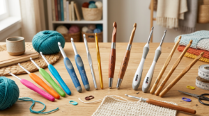
Color wheel basics for your amigurumi
You’ll use the color wheel as your quick map for choosing yarns that look great together on your amigurumi. Think of it as a compass for color harmony: it helps you decide which colors will feel calm, bold, or playful when you stitch.
Your first move is to see primary colors, secondary colors, and all the in-betweens. The wheel shows you warm colors like reds and yellows that feel energetic, and cool colors like blues and greens that feel calm. When you pair these on your project, you’ll notice textures and shapes pop in a new way.
As you practice, you’ll start spotting patterns fast. You’ll see how certain pairs create balance, while others punch above their weight and steal the spotlight from your stitch design. The wheel is a handy coach that never tires.
How the color wheel guides choices
When you’re picking yarn for your amigurumi, use the wheel to choose sets that feel right for your character. If you want a gentle look, pick colors that sit close to each other on the wheel—these are your Analogous Colors. They blend softly and don’t shout. For a lively, eye-catching piece, grab Complementary Colors that sit opposite each other; they clash in a fun, dynamic way that makes details stand out.
If you’re unsure, start with a neutral base like cream or taupe and add small pops of color from across the wheel. This keeps your project balanced while still giving it personality. Remember, you don’t need every color in the rainbow. A few well-chosen hues can create a strong, cohesive look.
As you grow more confident, you’ll notice how light and dark values change the vibe. A pale pink with a deep navy will feel chic, while a bright yellow with a forest green can feel playful. The wheel teaches you to mix values as well as colors, so your amigurumi reads clearly from stitches to smile.
Color theory for amigurumi made simple
Color theory isn’t a maze; it’s a toolbox you carry with you. Start with a simple rule: pick one main color and two accent colors. Let your main color set the mood, then use your accents to pull out details like eyes, nose, or tiny accessories. This keeps your design clean and stylish.
Next, think about contrast. Your main color and your accent should stand apart enough for features to pop, but not clash so hard you blink at your own work. If you’re unsure, test on a small swatch first. That tiny sample saves you from reworking a full project. The wheel helps you predict how a tiny change will shift the whole look.
Now add texture. Amigurumi loves texture, and some colors read differently when fiber shows light or shadow. A smooth, solid color base looks different than a tweed or heather yarn. Use the wheel to pair a flat color with a textured one to get depth without losing harmony. Your pieces will feel richer and more alive.
Quick tip to read the wheel
When you’re unsure, scan for a color you love and then check its neighbors for safe choices, or flip to the opposite side for a bold pair. If you want calm, choose colors that sit near each other. If you want pop, grab those opposite colors. Keep your base neutral and let your accents do the talking.
Contrast vs harmony in amigurumi
You’re shaping yarn into tiny worlds, and the colors you choose set the mood before you sew in the eyes. When you use contrast, you give each piece its own voice: a bright color pops against a dark one, making features stand out. With harmony, you create a calm, cohesive vibe where colors blend softly, so the whole amigurumi feels like a single scene rather than separate parts. Your goal is to decide which route serves your character best: a bold hero with sharp edges or a gentle friend with soothing curves. Think of contrast as a shout, harmony as a whisper, and you get the balance you’re after.
You’ll notice that contrast can guide attention. If you want a nose to grab a viewer’s eye or ears to frame a cute face, a lighter shade against a deeper base pulls the eye exactly where you want it. Harmony, on the other hand, helps you tell a story across the whole plush. When you pick colors that sit close on the color wheel, the piece feels unified, almost like it came from one mood. Both tools are powerful, and knowing when to switch between them makes your amigurumi feel deliberate, not random.
As you experiment, you’ll learn that contrast and harmony aren’t enemies. They’re teammates. You can use a contrasting accent on a harmoniously colored body to highlight personality, or you can soften a bold contrast with a unifying background color. The trick is to test snippets, not commit to a full project you’re unsure about. A quick swatch can save you hours of rework and help you see if your character reads the way you intend.
Contrast vs harmony amigurumi colors explained
When you explain color choices to someone else, frame it around how a character would react in a scene. Contrast colors give your amigurumi a spark of life: a bright scarf on a muted body makes the scarf steal the show. You might use a warm red against a cool blue to make the face feel lively, almost as if the character is smiling with their whole body. This is where you’ll hear terms like complementary and analogous. Complementary colors sit opposite each other on the color wheel and push each other, creating energy and emphasis. Analogous colors sit side by side and blend smoothly, giving a soft, cohesive mood. Your choice depends on whether you want excitement or ease.
Harmony comes from choosing colors that share a common vibe. If your amigurumi is a sleepy cat, you might pick taupe, cream, and a touch of dusty rose. Those colors don’t clash; they sing the same tune. You’ll notice a gentle, almost lullaby feeling when the palette stays within a tight family. Contrast, in contrast, can be used sparingly to avoid shouting at the viewer. A single bright button or a neon eye can become your focal point in a sea of calmer tones. Remember: you’re guiding the eye, not blinding it.
In this dance, you’ll hear about Complementary vs Analogous Colors: Which Works Best for Amigurumi? Sometimes you’ll want to mix them, starting with a harmonious coat and adding a bright, contrasting eye detail. Other times you’ll lock in a bold complementary scheme for a character that wants to leap off the page. The key is to test and compare. Put two color options side by side and ask which version reads clearer: the one with stronger contrast or the one that feels more knit together. You’ll learn faster by trying small swatches first.
When you should choose contrast or harmony
Choose contrast when your goal is personality and focus. Your character’s face or a signature feature deserves attention, and a contrasting color makes that feature pop. If your amigurumi needs to express energy or playfulness, a bold accent against a quieter body will deliver that punch. You’ll also pick contrast for accessories that need to stand out, like a bright scarf or a gleaming button. In short, use contrast to tell the viewer where to look and what to feel.
Choose harmony when you want a calm, cohesive look that’s easy on the eyes. If your character is gentle, shy, or dreamy, stay in a similar color family. Harmony helps the eyes glide over the piece as a single story rather than a collection of parts. It’s perfect for larger projects where you don’t want one element to steal the show. You’ll find harmony works great for sets, animals with soft fur, or characters meant to evoke coziness.
A quick rule of thumb: if an element would feel jarring in real life, give it a softer home in harmony; if you want something to shout for a moment, give it contrast. And don’t hesitate to mix deliberately. A tiny contrasting nose on a harmonious body can become the defining moment of your amigurumi’s personality.
Picking yarn colors for your amigurumi
Choosing yarn colors is your first step to making something you can be proud of. You’ll see details pop when you pick the right hues, and your amigurumi will feel alive in your hands. Start by thinking about the character you want to bring to life, then test a few color combos on scraps before you commit. Remember, you’re in the driver’s seat, and small swaps can change the whole mood of your creation. Use bold color ideas to make your project pop, but keep a few neutrals in your toolkit so you can ground your design when needed.
Think about the story your amigurumi tells. Do you want it to look friendly or bold? Your color choices should support that vibe. If you’re unsure, lay out a quick swatch board: three to five colors that could work together, then compare them side by side under good light. Your eye will tell you which ones feel right. And don’t fear stepping outside your comfort zone—a splash of unexpected color can become your signature.
As you practice, you’ll learn how different brands and yarn weights act on the same pattern. Keep a simple notebook of which colors you used and how they looked when finished. That way you’ll reproduce favorites and refine your palette with confidence. Your amigurumi should feel like you, not a copied idea.
Choosing yarn colors amigurumi: fiber and sheen
Your yarn’s fiber changes how color reads in real life. Natural fibers like cotton show colors a touch more softly, while synthetic blends can make colors appear brighter and sharper. If you’re aiming for a cozy, cuddly look, cotton with a matte finish will stay true to the hue you picked. For a little edge or shine, a silk or silk-blend can bring life to highlights without overpowering the base color. Consider how much you want the yarn to glow in light and how it will wear over time.
Sheen matters because it affects perception. A high-gloss yarn can make colors look lighter and more saturated, while a matte yarn will give you deeper, more muted tones. If your design has small features or pale skin tones, a touch of sheen can help colors pop without glaring. On the other hand, if you want soft, vintage vibes, choose a matte finish. Your goal is to keep color true when you crochet, so pick fibers that align with the mood you want.
Different fibers also behave differently in the same color shade. A red in cotton might look different from a red in acrylic. Test a tiny swatch in your actual pattern to see how the color reads after stitching, blocking, and lighting. Your future self will thank you for the small test swatches that save you from color surprises.
How texture and stitch show color
Texture changes color perception more than you might expect. A smooth single crochet shows color evenly, while a textured stitch like half double crochet with a tight fabric will make color appear more varied due to light catching the stitches. You’ll notice this when you switch from a flat surface to a bumpy body: the same color can look lighter on one part and deeper on another. Use this to your advantage by choosing a color that reads well in the main body, then a contrasting shade for details.
Stitch density also plays a role. Tighter fabric absorbs less light, which can keep colors looking crisp, while looser fabric may look washed out. When you plan a color palette, think about how dense your stitches will be in different areas. If you want a bright, cheerful face, pick a color that stays vibrant even when the stitches are close together. If you’re aiming for softness, a color that reads warm through the fuzz of the stitches works wonders.
Don’t forget how shading can work in your favor. A single color can look like multiple shades through careful layering, like adding a lighter belly or a darker ear. You don’t need new yarn for every shade—just switch to a lighter or darker hue within the same family to get depth. You’ll get a more professional look without complicating your supply chain.
A simple yarn color checklist
- Test swatches of your main color and any accents in the same pattern, under the lighting you’ll usually crochet in.
- Note fiber and finish (matte vs. shiny) for each color you plan to use.
- Compare color perception in daylight and indoors to avoid surprises at showtime.
- Pair colors with a plan: have a primary color, a secondary for accents, and a neutral to balance.
- Keep a palette log: jot what works, what doesn’t, and your favorite combos for future projects.
When to use complementary colors
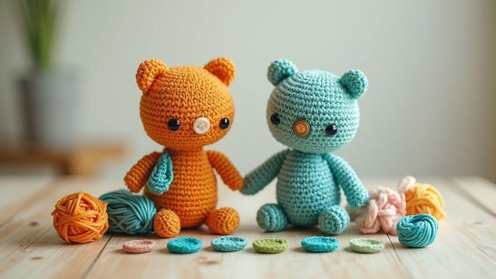
Complementary colors sit opposite each other on the color wheel. You use them when you want a bold, eye-catching look that still feels balanced. If your project needs a strong focal point, reach for these pairs. You might choose a bright red with a deep green for a holiday feel, or blue and orange for a sporty vibe. The trick is not to overdo it—let one pair take center stage and keep surrounding tones calmer. Your design will feel lively without shouting at every corner.
In amigurumi, complementary color pairs help your piece pop in photos and real life. Think of a cute bear with a creamy body and teal accents, or a little penguin with orange beaks against dark bodies. The contrast guides the eye where you want it and adds personality without clutter. If you’re unsure, start with a single accessory in a bright complement and leave the rest neutral. You’ll be surprised how much depth a simple swap can create.
When you’re deciding, ask yourself how the colors will read in natural light. Some pairs look warm and cozy indoors but too electric outside. If your goal is warmth, pick warm complements; if you want zing, go for cooler complements with a bright pop. Your end result should feel intentional, not random. Use complementary colors to highlight the story your amigurumi tells.
Using complementary colors in amigurumi for accents
Accents are tiny but mighty. Use a bold complementary color on small details like ears, paws, or a scarf to draw attention without overpowering the main body. A bright red nose on a white snowman or a lime-green bow on a soft gray bunny makes the character memorable. Keep the body color calm so the accent shines. This approach creates a clear focal point and makes photos more engaging.
When you sew or crochet, switch to the accent color for just the final few stitches around an edge. The contrast will stand out in pictures and real life. If your piece is all one tone, add a tiny loop or button in the complementary color to catch the eye. Remember: less is more. A single bold accent can transform your design from nice to wow.
If you’re unsure about the exact shade, test swatches on scrap yarn first. Different materials reflect color differently, and you’ll want the final look to stay crisp. Keep notes of which shade pairs work best with your fabric or yarn type so future projects go faster. Your accents will feel deliberate and polished.
How contrast makes eyes and buttons pop
Eyes and buttons are tiny, but they draw the biggest attention when they contrast with the face or body. Use a lighter color for eyes on a dark fur, or a dark button on a light shirt. The contrast creates definition, making expressions read clearly from a distance. If you’re aiming for a friendly vibe, softer contrasts work well; for a bold character, go high-contrast black eyes on a pale face or bright buttons on a solid shirt.
When choosing a button color, consider the yarn texture too. Glossy buttons reflect light beautifully against matte yarn, which makes them stand out more. If you’re stitching on eyes, tiny safety eyes in a complementary shade can add depth without complicating your pattern. Consistent contrast across all facial features keeps your amigurumi looking cohesive and expressive.
Don’t stress every tiny detail. Pick one or two eye or button colors that stand out against the body and keep the rest neutral. Your character will look lively without fighting for attention. And if you ever need a quick vibe change, swap those accents—the whole mood shifts in seconds.
When to use analogous palettes
You’ll reach for analogous palettes when you want a cohesive, harmonious look that feels natural and soft. These color families sit beside each other on the color wheel, giving you a gentle flow from one shade to the next. Use them when your amigurumi needs a calm, cohesive mood—no bold contrasts that shout. If your project aims for cozy comfort or a dreamy, lullaby vibe, analogous palettes are your go-to. Think of a sunset yarn set that blends from peach to coral to soft pink; the transition feels seamless and soothing. In practice, you’ll notice fewer hard edges and more blanket-worthy warmth that invites touch and hugs.
Analogous colors work wonders for smaller projects where clutter can steal the spotlight. When your design features simple shapes or limited textures, these hues keep the eye moving smoothly without fighting for attention. You’ll often see them in baby critters or soft pets where you want the fabric to look plush and inviting. If you’re ever unsure, start with a main color and pick two neighboring shades to pair with it; your palette will look intentional without shouting for attention. The rule is: let the neighbors whisper, not scream.
For beginners, analogous palettes reduce decision fatigue. You won’t chase perfect contrasts; you’ll shape a natural, uniform look with confidence. As you grow, you can still push contrast by adding a small accent that sits just beyond the main group, but the base stays gentle and unified. Your amigurumi will feel cohesive, like a single, cozy sweater stitched around a bear’s shape.
Analogous colors amigurumi for soft blends
You’ll love how analogous colors create soft blends that look hand-dyed and organic. Start with a main hue, then pick two neighboring colors to round out the set. The transitions are effortless, making fur or fabric appear plush rather than striped. When you crochet, think of the yarn as a sketch that bleeds gently from one tone to the next. This is perfect for creatures with round bodies where you want a seamless coat.
Keep the balance in mind: don’t drift too far into high-contrast territory within the trio. The goal is a whisper of color, not a shout. If your main color is a warm taupe, add lighter taupe and a touch of honey to keep the blend tender. You’ll notice the surface looks velvety and soft, which is exactly what you want in amigurumi that begs to be hugged.
For texture, rely on stitch variety rather than color jumps. A simple single crochet with small, deliberate color changes yields a smooth, cozy finish. If you’re unsure about color order, place your darkest shade near the base and lightest toward the edges to create a subtle highlight. The result is a cuddly character that feels alive, not painted.
Pick neighboring hues on the wheel
You’ll pick neighboring hues on the wheel to guarantee a natural, connected feel across your pieces. Start with a primary color and choose its neighbors to build a soft gradient. This approach keeps your amigurumi from looking flat or jarring, especially when you’re shaping faces or paws where you want gentle depth. The wheel’s nearby colors slide into each other with ease, giving you a polished, professional finish.
If you’re making a fox or bunny, a palette that runs from cinnamon to peach to warm coral reads as light, fluffy fur. For a sea creature, a glide from teal to aqua to seafoam creates a watery, friendly look. You’ll notice the transitions feel effortless, like a painted watercolor that never harshly stops.
When you match neighboring hues, you can still introduce a tiny accent to prevent the set from becoming too monotone. A splash of cream or a dash of rust can lift the overall feel without breaking the harmony. Your amigurumi stays sweet and coherent, with a touch of personality.
Create smooth blends with three tones
You’ll create smooth blends with three tones to keep your amigurumi lively yet gentle. Choose a light, a mid, and a dark shade that sit next to each other on the wheel. This trio gives you depth without abrupt shifts, so facial features and curves read clearly without shouting. Use the lightest for highlights, the darkest for shadows, and the middle for the main body. The result is a well-balanced, soft look that invites closer inspection.
Practice by laying your three colors along a seam and blending as you go. You’ll feel the transition ease up with each row, especially on curved surfaces. If you’re unsure about placement, think of light as where the sun would naturally hit—top of the head, nose bridge, or cheek tops—and dark along the underside for a gentle contour.
Remember: keep your three-tone blends consistent across the main areas. A uniform approach helps your character read as one piece, not a patchwork of random spots. This consistency is what makes your amigurumi feel professionally finished.
Best color schemes for amigurumi styles
Amigurumi lovers, you’re choosing colors that make your tiny characters pop. Your color scheme sets mood, personality, and how cute your creation looks in real life photos. Start with a simple plan: pick a main color, pick a couple of accent colors, and test how they play together in natural light. You’ll notice that some combos read cozy and friendly, while others feel bold and energetic. The right mix helps your toy tell a story without saying a word. Remember to keep balance: one dominant hue, one or two accents, and a neutral to ground everything.
Work with your yarn choices to keep colors true. If you’re unsure, swatch a tiny circle or two before committing. This saves you from the headache of redoing a whole project later. And when you do test swatches, note how the colors look in daylight versus lamp light. The same yarn can shift a bit, which changes the feel of your amigurumi. By testing upfront, you’ll avoid surprises and keep your design on track.
Finally, don’t forget the power of contrast. A lighter body with darker eyes or a bright splash of color for a scarf can make features stand out. You want your best details to read at a glance, especially in photos. Bold choices aren’t wrong, but you’ll get better results if you align contrast with the character’s vibe. Keep a simple rule: color should serve the story of your toy. Complementary vs Analogous Colors: Which Works Best for Amigurumi? is a question you can revisit as you refine your palette.
Best color schemes for amigurumi: cute pastels
Pastels bring a soft, approachable vibe to your amigurumi. You’ll feel the charm in pale pinks, baby blues, mint greens, and lilacs. Use a main pastel for the body and add one or two lighter accent colors for small details like ears, cheeks, or a tiny scarf. Gentle contrasts keep the toy inviting, like a warm hug from a fuzzy friend. If your character is shy or sweet, pastels are your best friend.
Pair pastel bodies with tiny pops of brighter white or cream for eyes and mouths. This makes facial features readable without stealing the show from the color story. A soft pastel palette photographs well and reads friendly in real life, too. If you want a little more personality, swap in a slightly deeper pastel for accessories—think a mint bow or lavender buttons. The key is balance: keep most of the piece in the core pastel while saving a vivid accent for focal points.
Keep lighting in mind. Pastels can wash out in harsh sun, so shoot in diffuse light or early morning/late afternoon sun. If you’re gifting or selling, you’ll love how pastel schemes stay charming across many photos and angles. The softer tones invite hugs, and that’s exactly the vibe you’re aiming for with cute amigurumi.
Bold schemes for high contrast toys
Bold color schemes punch through, giving your amigurumi energy and street-cred. Think primary reds, electric blues, sunny yellows, or deep teals. Use one dominant bold color for the body and add two strong accents to highlight features like eyes, ears, or a tiny hat. This combo makes your toy look lively and modern, perfect for characters that want to stand out on a shelf or in a photo.
When you use bold colors, make sure the facial features aren’t overwhelmed. You want eyes to pop, not blend into the body. Accents like a white or cream muzzle, inner ears, or a contrasting stitch color for a mouth helps with expression. If your character is playful or adventurous, bold colors reinforce that story. Just remember: too many bright colors can fight with each other, so keep the palette tight.
Dark or cool undertones in your main color can ground a bold palette, while a warm accent keeps it friendly. Try pairing a bright blue body with an orange accent and a white facial detail. This triad communicates fun and confidence without becoming chaotic. Test a tiny version first to see how the colors interact in real light.
Match scheme to your character
Your character’s mood and story should guide your color choices. If you imagine a shy fox, perhaps warm oranges with cream accents create cozy vibes. If you picture a brave explorer bear, you might lean on brown tones with a bold red scarf for a courageous look. Let the personality guide your palette, not the trend. Your audience will feel the character’s traits in the colors you pick.
Start with a core color that represents the character’s main trait. Add a secondary shade to highlight features and a neutral tone to balance everything. The details you choose—eyes, mouth, accessories—should echo the core color or offer a small, deliberate contrast. If you’re unsure, try a few quick color sketches on paper or a swatch card before committing to yarn.
As you design, check that the colors feel cohesive in photos. If you can’t get a clean shot, your palette might be too busy. Simplicity often wins: one dominant color, two supporting shades, and a safe neutral. Your character will translate better in both playgrounds and online galleries when the scheme matches their story.
Color pairing tips you can use
Color pairing can make your amigurumi feel alive. You’ll notice it instantly when the colors work together and when they don’t. Start with a plan, then let your intuition guide you. Think about the feeling you want: playful, cozy, or bold. Use a main color and a couple of supporting tones to keep things balanced. When you pick colors that live in the same family, your piece reads as cohesive; when you mix bold contrasts, it can pop in a fun, cartoonish way. Remember, your yarn choice matters as much as the color itself—two different textures can change how a color reads.
Beyond choosing colors, consider where your piece will live. If it’s a toy for a child, you might pick warm, friendly tones. If it’s decorative, you can lean into deeper hues or smoother pastels. Keep lighting in mind, too. A color that looks bright under shop lights can soften in daylight, and that changes how your amigurumi feels. Use small swatches or test bits on a stray stitch to preview the final result before you commit to the whole project. Your eye will thank you for catching clashes early.
Finally, document your color choices as you go. A quick note or a photo helps you recreate the look later, or share your process with friends. If a color isn’t working, you can swap in a shade you already know plays well with the others. The goal is harmony, not overwhelm. With a clear plan and a few quick tests, you’ll pull together a design that feels intentional and polished.
Color pairing tips for amigurumi: start with a neutral
When you start with a neutral, your pops of color have room to shine. Neutrals like cream, taupe, or graphite gray act as a clean canvas that makes bright accents stand out without competing. Your main body color can be a soft neutral, then you add tiny color sparks for eyes, noses, or clothing. The trick is to keep the neutrals from turning bland—add texture with stitch patterns or a subtle shade variation in one area to keep it interesting.
Try pairing a light neutral base with a single bright accent. For example, a pale beige body with a bold teal or coral accessory reads playful and modern. If you’re making a creature with a lot of character, a warm neutral (like apricot) lets cooler accents (like mint or teal) pop, giving your piece a friendly, approachable look. You’ll notice that adding small neutrals in paws, ears, or facial features helps the overall design feel cohesive rather than busy.
A good practice is to keep at least one component in a neutral shade even in more color-rich designs. This helps the eye rest and keeps the overall balance intact. If you’re unsure, try a quick mock-up with a scrap piece and compare how the neutral plays with the accents. You’ll be surprised how much this simple step can improve your final amigurumi.
Amigurumi color combination ideas for accents
Accent colors act like little exclamation points on your design. Use them to highlight eyes, cheeks, accessories, or tiny details that give your character personality. A classic pairing is navy and coral—dark blue bases with warm coral accents feel friendly and timeless. Or go bold with black and yellow for a high-contrast look that’s striking and graphic.
If you want a softer vibe, try pairing dusty rose with sage green accents on a light beige body. For a sunny, cheerful feel, combine sky blue with sunny yellow details against a cream body. Don’t forget metallic threads or a spark of white for tiny highlights to give your amigurumi a touch of whimsy. The key is to repeat your accent color in at least two places to tie the design together.
When you’re unsure, lean on two-color accents rather than three. One accent can do the job of drawing attention, while a second supports it without creating a noisy look. Practice with scraps to see how your accents interact before you commit to the whole project.
Quick pairing rules to remember
- Start with a neutral base and add two accents for balance.
- Use Complementary vs Analogous Colors: Which Works Best for Amigurumi? as your guiding question if you’re unsure.
- Keep the accents in smaller areas so the main color isn’t overwhelmed.
- Test colors together on a small swatch before you crochet the full piece.
- Repeat the accent color in at least two places for cohesion.
Test colors with swatches and light
You’ll want to see how colors really act in your space, not just in a catalog. Start by making a few simple swatches on sturdy paper or fabric, then lay them out in the area you’ll use most. When you test swatches, you can compare how a warm red looks next to a cool pink, or how a deep navy pairs with a bright teal. Take notes on each pairing, and don’t be shy about moving pieces around. The goal is to spot colors that feel right together in real life, not just in a photo.
Treat light like a co-designer. Indoors, glass and bulbs shift color temperature, which can soften or sharpen hues. If you’re planning a space with a lot of daylight, you’ll catch cooler undertones that might clash with a warm fixture. Use a neutral white light as your baseline so you can see true tones. You’ll be surprised how a color you love at dusk can look flat by noon. Your swatches are your reference map—treat them like a friend who helps you decide before you buy.
Record how every swatch reacts in your room. Note things like this blue leans green under LED or this ochre warms up a gray wall. By tracking these shifts, you’re building a color playbook you can reuse later on other projects. Your aim is consistency across fabrics, walls, and accents, so you don’t waste time chasing the same problem again. The more you log, the faster you’ll decide what works and what doesn’t.
Make swatches to compare combinations
When you compare color pairings, you’re testing more than two shades—you’re testing harmony. Create small clusters: one with complementary colors, one with analogous colors, and one with a bold accent. This practical setup lets you see how patterns and textures play with color in real life. Keep your swatches in a pocket chart or a simple binder so you can flip through quickly while you cook up ideas.
Use real-world materials for your swatches. If you’re designing a crochet bundle or a textile project, stitch or sew tiny samples in the actual yarn or fabric you’ll use. You’ll notice how a glossy surface reflects light differently than a matte one, and that matters for how lively a color feels. If a pair seems bright on paper but dull in person, you’ve learned something valuable without committing a large chunk of your budget.
Check colors under indoor and daylight
Daylight is your true test. Compare colors in the brightest window you have and under your most common indoor lighting. The goal is to see how colors shift between scenes. A palette that reads warm in the sun might read cooler when lamp light hits it, and that can change your whole design from welcoming to clinical in seconds. Do this check in stages: morning sun, afternoon sun, and then under your evening lamps.
Keep notes on each shift. Write down which tones you prefer in daylight and which you love under indoor lighting. If you want a cohesive vibe, you’ll choose colors that stay balanced in both scenarios. If not, you’ll know which accents you need to adjust to keep the look consistent. This is where your color plan moves from theory to real, wearable design.
Easy swatch test you should do
Do a quick two-minute live test. Tape two swatches side by side on the wall or a board you’ll actually look at daily. Stand back, then walk closer, then step aside again. Feel how your eye moves between the two; if one color dominates, swap it out. This fast test saves you from buying multiple large paints or fabrics you won’t use.
Use a familiar object nearby to gauge scale—like a couch, rug, or curtain. Seeing how a color plays with your existing pieces helps you decide if you need the brighter version or a softer shade. That tiny test nails down a big decision without wasting time or money.
Test colors with swatches and light (continued)
Your color journey isn’t over until you’ve seen the results in real life. Swap in a few new swatches every week until you land on a trio that feels like it belongs together. Your goal is a palette that looks polished under both daylight and lamps, with enough contrast to keep things lively but not chaotic. Remember, practice with swatches is practice with taste—and your taste matters more than trends.
Keep a running list of your favorite combos and why they work. When you pin down the reasoning—warmth, contrast, balance—you’ll be able to replicate success in future projects. You’ll also be ready to defend your choices to others who might question your picks. Your color method becomes your design defense, and that confidence pays off in every room you touch.
Design rules for faces and small parts
Your amigurumi’s face and tiny details set the entire tone of your piece. Start with bold decisions: pick a focal color for the face and keep tiny parts like eyes, noses, and mouths clearly defined. Use simple shapes that read well from a distance, since small parts can blur when you bend or stretch the fabric. When you sketch, think in silhouettes first—a strong profile or a gentle curve can carry emotion without a lot of texture. You’ll notice that consistent eye size and placement create a friendly character, while uneven features can give whimsy or personality—just know what you’re aiming for before you stitch. Bold choices beat busy details every time.
For color, keep your face brighter or more contrasted than the body so it reads as the focal point. If the body is tucked in neutral tones, a lighter or warmer face pops without shouting. If you want a softer vibe, tint the facial areas with the same hue family as the body but lighter, so everything blends nicely. You’ll save time by using a limited palette for facial features: one shade for eyes, one for mouth, one for blush. Remember, precision counts—tiny stitches and even spacing make the face look polished, not rushed. Clean lines and consistent stitch tension drive the wow factor.
When you’re close up, you’ll notice texture matters less than placement. Place eyes at about half the head height for a friendly look, with a tiny gap between them. The mouth should sit just below the center line—too high and you’ll look surprised; too low and it feels stern. If you add cheeks, tiny blush spots should be symmetrical and soft. Use a light hand with thread work; it’s easier to adjust early than redo later. Your goal is a cohesive, readable face that communicates emotion with minimal detail. Consistency and symmetry are your best friends.
Use complementary colors amigurumi for facial contrast
You’ll get the strongest facial contrast when you use complementary colors for features against the face base. If your face is warm, counter with a cool feature color to make the eyes and mouth pop. For example, a peach face with teal or blue accents instantly reads as lively, not muddy. Pair warm cheeks with cool lips for a playful bite that doesn’t overwhelm the whole piece. The trick is to test the contrast in a small swatch first; you’ll see how light reflects differently on each shade and how the stitches look up close.
Keep the rest of the body in neutrals or low-saturation tones to let the facial colors stand out. When you’re choosing, think about what emotion you want: bold contrast for cheerful characters, or subtler pairing for cozy, reserved figures. If you want a modern vibe, use high-chroma opposites on small parts while keeping the face calm. Remember, the eyes are often the first thing people notice, so give them the strongest contrast—a crisp white and deep pupil against your chosen face color will hold the gaze. Contrast is your shortcut to clear expression.
Now, if you’re worried about harsh edges, blend edges softly with a tiny amount of the base color or a neutral shade to fade transitions. Use satin or matte finishes on different parts to control glare and depth. You don’t have to match every color exactly; slight deviations add charm and personality. The rule of thumb: the facial features must stand out first, with colors doing the supporting work. Let the face lead, colors support.
Use analogous tones for body harmony
Analogous tones on the body create a calm, cohesive look that lets the face shine. Start with a base color you love and add shades that sit next to it on the color wheel. This keeps the body from competing with the face while still giving depth through light and shadow. You’ll find that subtle shifts in saturation give form to limbs, torsos, and clothing without drawing attention away from the face. The trick is to keep the transitions smooth and gradual, not jarring. Analogous harmony makes your piece feel intentional.
To keep things visually interesting, use one slightly darker shade for shadows under the chin or behind the ears, and a lighter shade where light would naturally hit. You can also introduce a tiny accent color in accessories or tiny stitches on the body, but limit it to one or two spots. This prevents clutter and keeps the body feeling unified. If you want a playful vibe, use two similar tones for the body but reserve one bold shade for a small patch—like a pocket or a scarf. Subtle shifts create depth without distraction.
When planning your palette, map it out before you start stitching. You’ll save time and avoid color clashes. Try a simple test: color swatch, then a small mock-up on yarn you’re using. If it looks cohesive on screen or in hand, you’re good to go. Consistency in tone across the body makes your amigurumi feel finished and polished. Plan your palette, then stitch with confidence.
Fast face color tips that work
- Pick a dominant face color and anchor the rest of the palette around it. Use one lighter shade to highlight and one darker shade to shadow. This trio gives instant depth without overworking it. Keep it simple, clear, and readable.
- Save time with strategic placement. Place your darkest shade where you want depth and your lightest shade where you want brightness. This helps the face pop at a glance. Reading the face should be instant.
- Test on a scrap first. A quick swatch helps you see how the color reads in real light, which is often different from a thread in your hand. If it reads muddy, switch to a higher contrast or a warmer/cooler tint. Don’t guess—test.
- Use small, controlled stitches for facial features. Tiny backstitches or french knots for eyes, a small satin stitch for a mouth, keep the edges clean. Neat edges make the color sit properly and avoid blobby lines. Precision wins.
- Finish with a light spray or gentle wash if you’re worried about color transfer. Let it dry fully, then re-evaluate the contrast. You want the face to stay crisp, not bleed into the body. Keep it crisp.
- Refer back to your palette as you work. If you’re uncertain, replace a face shade with a safer, clearer option rather than overcomplicating with too many hues. Less is more when you’re careful.
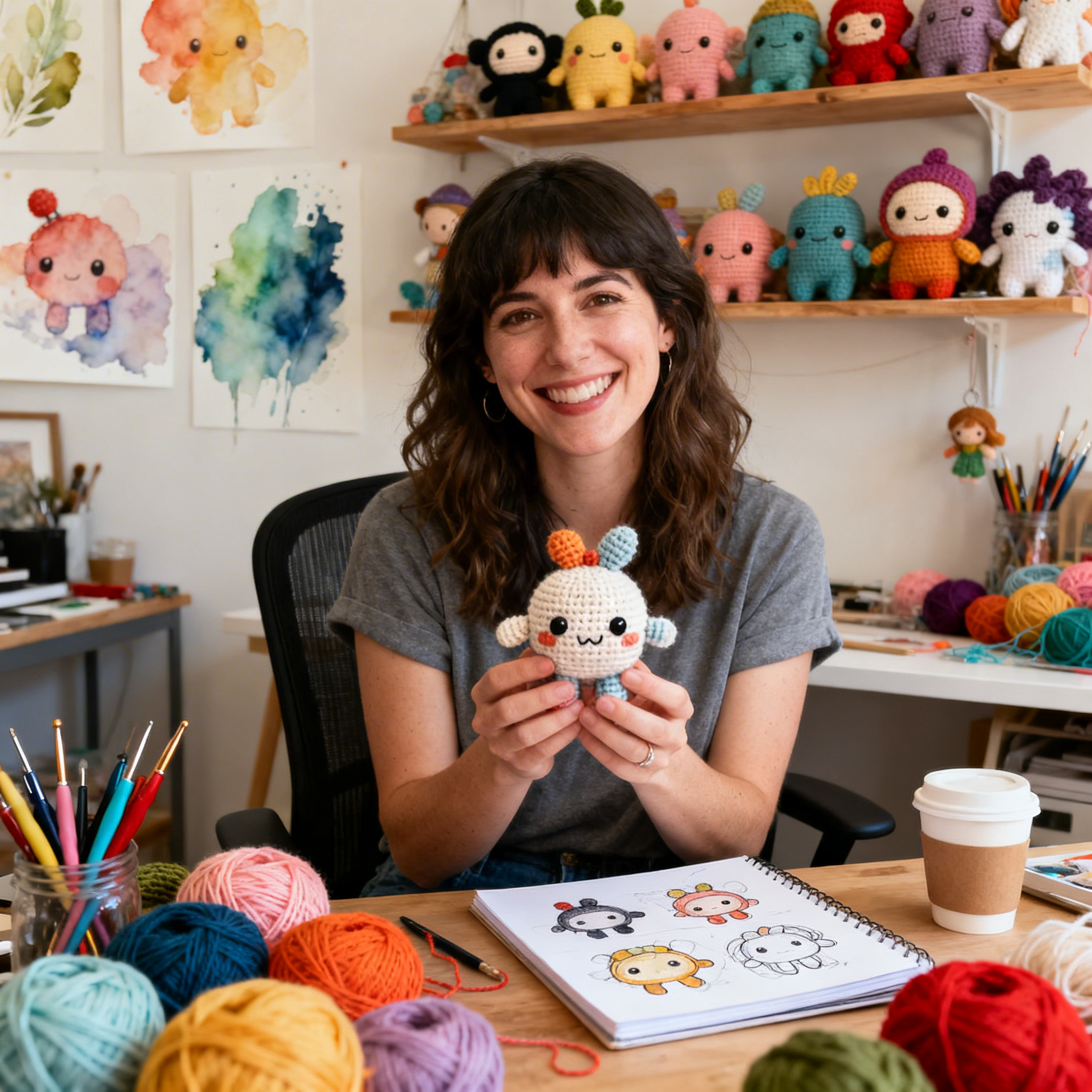
Clara Fern — Crochet Artist & Amigurumi Designer
Clara Fern is a crochet artist and amigurumi designer based in Austin, Texas. With 9 years of experience working with yarn and hook, she transformed a lifelong passion for handcraft into a creative mission: making amigurumi accessible, fun, and deeply rewarding for crafters of all levels.
Clara discovered amigurumi during a trip to Japan in 2017, where she fell in love with the art of bringing tiny characters to life through crochet. Back home in Texas, she spent years studying color theory, design principles, and advanced crochet techniques — developing her own signature style that blends kawaii aesthetics with original character design.
Through maclafersa.com, Clara shares everything she has learned — from choosing the right yarn and reading your first pattern, to designing fully original amigurumi characters from scratch. Her writing is known for being clear, detailed, and genuinely helpful, with no steps skipped and no secrets kept.
When she’s not crocheting, Clara enjoys watercolor painting, visiting local yarn shops, and drinking way too much coffee while sketching new character ideas.