Create Depth with Shades and Tints
You can add real dimension to your yarn art by playing with value—how light or dark a color is. Use dark shades and lighter tints to prevent shapes from sitting flat. Edges soften and forward pops appear, like a shadow map guiding the eye. Keep a few core colors and mix in two or three shades or tints per project. The result feels finished, not flat, and your amigurumi reads as more alive.
Value changes aren’t about swapping yarn brands; they’re about pairing colors you love with small brightness shifts. A pale pink can be a tint of your favorite rose, or a charcoal a practical shade of black in your stash. Plan ahead to layer these values so lighter areas catch light and darker areas ground the piece for cohesive flow.
If you’re unsure where to start, pick a focal color and build a ladder of two or three shades around it. Use the lightest for highlights, the darkest for shadows, with middle tones in between. This keeps the design cohesive while adding depth that makes stitches read intentional, not random.
How value changes make shapes pop
Value changes create contrast that makes edges crisper. A lighter shade near the top reads as highlight, a darker shade at the bottom anchors it. This helps even simple rounds look purposeful, with curves becoming more readable and facial features popping with subtle brightness differences. A deliberate gradient guides the viewer’s eye to the center or a special detail. You don’t need flashy colors to make an impact—just a small shift in shade. Pair a bright main color with a deeper shade of the same family for subtle drama that remains harmonious.
Using shades and tints in amigurumi
In amigurumi, tints and shades act like sunglasses for your shapes. A tint softens edges for a gentle, friendly look, while a shade adds definition and calm. Use tints on cheeks or ears to imply softness and shades on the underbelly or around the eyes to suggest depth. Balance is key: avoid too many value changes in one spot to prevent confusion of the shape.
When assembling pieces, test a small swatch first. Layer a tint over your base color to see the glow, then try a shade on a seam to ground the piece. If a value feels right, copy it to similar areas for consistency. Your eye will thank you for the visual rhythm.
Choosing tints and shades that work
Choose tints close to your base color for cohesion. If your main color is teal, pick a minty tint and a deeper teal shade rather than jumping to blue or green. Test how the tint or shade reads under light in your space since different yarns react differently. Don’t be afraid to push contrast a little: a darker shade in a shadowed spot can make stitch texture stand out, while a bright tint on a highlight adds playful drama. This approach proves depth can come from value shifts, not just hue variety.
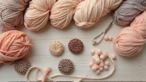
Choose Yarn for Tone and Texture
You’re choosing yarn to set your project’s mood. Tone is how warm or cool the finished piece feels, and texture is how it looks and feels to the touch. The yarn should sing with your stitch choice and pattern. For a soft, cuddly look, use a plied, brushed, or fluffy yarn. For crisp details, choose a smooth, compact yarn. Balanced color, sheen, and thickness help your outcome feel deliberate.
Your yarn choice also guides color behavior side by side. Light, airy yarns let colors fade gently from one shade to another, while dense yarns keep colors bold and sharp. For a calm vibe, pick yarns with similar feel and weight. If you want playful high-contrast, mix textures—but test first with a swatch. In Monochromatic Amigurumi: Making One Color Look Stunning, the tone set by your yarn helps your single color shine even with subtle shade shifts.
Choosing yarn for tone and texture isn’t just about color. A yarn with a gentle halo softens edges, while a slick yarn makes details pop. If you’re new to color play, start with a yarn that holds shape but feels forgiving under your fingers. The same color can read very differently on two yarns—test swatches and pick the one that fits your project’s vibe.
Pick fiber, sheen, and colorfast yarn
Fiber matters as much as color. Natural fibers like cotton and wool add warmth and structure, while synthetic blends resist stretching and hold color well. For a fabric-like drape, choose a cotton blend that holds shape. For a sturdy, springy finish, wool-rich blends excel. Colorfast yarns ensure hues stay true after play and washing.
Sheen changes how light plays on your amigurumi. Matte reads color softly for gentle tones; shiny or cottony yarns catch light for a brighter look. Consider mood: sparkly shine for cheerful creatures, matte for understated characters. Colorfastness is non-negotiable if you plan to mix colors—your greens, blues, and pinks should stay put after washing. Check colorfast ratings and test a tiny swatch first. When you pick fiber, sheen, and colorfast yarn, your colors stay close to your vision.
How weight and gauge change the look
Weight and gauge shape your yarn-painted picture. Lighter weights (sport or fingering) create delicate stitches and a softer vibe, making a single color feel airy when paired with a tight stitch. Medium weights (DK or worsted) give more visibility and structure, ideal for clean rounds in amigurumi. Gauge matters: loose gauge softens edges; tight gauge keeps form crisp. A tiny gauge shift can transform a flat look into something alive.
Weight also affects color presentation: lighter weights reveal more tonal variation through finer stitches; heavier weights yield bolder, more uniform color blocks. Decide whether you want soft and dreamy or bold and defined, and let weight guide you.
Use Stitches to Build Texture
Texture comes from how you stitch and how you pair colors. You can keep a single color family lively by varying stitch density and form. Stitches create shadows, bumps, and rhythms your eyes read as depth. Different stitches catch light differently, so the same color can feel rich and dimensional.
Experiment with tight or loose stitching and stitch types to emphasize areas. Some stitches read texture better in a single color; for example, a simple surface stitch can create a soft rib or a tiny dot pattern visible through the shadow between stitches. Alternate rows of flat stitches with slightly taller stitches for a gentle tactile rhythm. You don’t need many stitches—just a thoughtful mix that suits your yarn’s thickness and hook size. Texture should speak with light and shadow, not color shifts.
If you want quick results, start with a small project to practice texture first. A tiny head or flat heart is enough for experimentation. Don’t fear accidents—quirks can become signature textures. By the end, you’ll see how stitches can replace color changes when chasing a cohesive monochrome effect.
Texture and stitch choices for monochrome amigurumi
Texture relies on stitch variety and how yarn takes light. You can mix weights to control texture: slightly thicker yarn supports bolder stitches, while a finer yarn allows quiet details. Use stitches that pull the fabric toward the center for round areas or even, tight stitches for flat surfaces. Consider a repeating pattern like a subtle rib or seed stitch to introduce texture without breaking the monochrome vibe. Let light and shadow do the talking, so the piece remains dimensional in one color family.
Simple stitches that read well in one color include single crochet, half-double crochet, and basic shells. Use them as the backbone and reserve trickier stitches for accents. A few rows of front post stitches can outline a curve and push it forward for a gentle 3D effect.
Make test swatches to compare texture
Create tiny swatches to compare how different stitches read in the same color. Test with single crochet, half-double crochet, and a post stitch to see which reads strongest. Observe how light plays on each fabric. Keep a small notebook or photo log of each swatch—yarn name, weight, hook size, tension, and stitch pattern—to reproduce the texture later.
Try Ombre and Tonal Effects
Ombre and tonal tricks transform simple stitches into depth. You don’t need a large palette—just a few related shades that fade into each other. Work from darkest to lightest in small sections, letting the gradual shift happen naturally. Plan color changes at natural seam points or where you want the eye to rest. Tiny swatches help you practice where the color should glide. The payoff is a piece that feels premium even in a single color family.
When you finish, soften transitions by blocking or light shaping. A bit of steam helps the yarn settle into its color zones, making tonal differences pop in photos and real life. Let the color shifts breathe across your stitches.
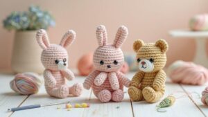
Monochromatic Amigurumi: Making One Color Look Stunning
Monochromatic Amigurumi: Making One Color Look Stunning is all about depth, texture, and careful color choices within a single shade. Start with a color you love, then find two or three related tones—one lighter, one darker, and perhaps a mid shade for balance. Texture becomes your ally: use different stitch densities and controlled color tweaks to create form and shading. A snug stitch in a dark shade can imply a shadow, while a looser stitch with the light shade suggests a highlight. Practice on a tiny figure first to see how light interacts with edges and curves.
As you build, you’ll find the story centers on placement of color, not color variety. Guide the eye with subtle shifts in tone to make the piece feel powered by color intelligence rather than a busy palette.
Blend shades with smooth joins
Blend shades smoothly by easing from one tone to the next over several stitches, rather than jumping to a new color. Carry the joining color through the transition for a softer edge. If bulk is a concern, switch to a lighter ball and pick up the new shade in small increments. The joins should disappear into the fabric’s flow, reading as a single lush surface.
End with a tight finish to hold color through wear and washing. A blended transition makes the amigurumi feel like it grew from one color, not a patchwork mosaic.
Minimalist and Monotone Design Tips
Keep the design calm and clean with a simple palette. Choose one main color and a neutral for the rest, like soft gray or ivory, so the shape remains the star. When selecting yarn, feel the texture—smooth plies knit up neatly and hold stitches tight for a tidy minimalist look. Test a tiny swatch to ensure the yarn supports the clean vibe.
Balance is crucial. Place the darkest shade where the eye lands naturally (often the face or focal feature) and fade to lighter tones toward the edges. Don’t overcomplicate details; a small seam or a single embroidered eye can read as thoughtful rather than busy. Finishing touches matter: a crochet edge or snug seam elevates the piece without overpowering its calm essence. Use a light touch with buttons or embellishments—less is more in minimalist and monotone designs.
Minimalist amigurumi color styling
Pair one bold accent with calm neutrals to anchor the design. Limit the bold color to a single feature—like a cheek glow, mouth, or paw patch—to create a signature without overwhelming the form. When mixing hues, keep contrast modest to preserve the minimalist vibe. Texture can carry color without additional shades; use slightly darker stitching lines or eyes in the main color to add depth while staying cohesive.
Character comes from shape and placement. A round head and simple limbs read as friendly and clean. A tiny stitched smile in the accent color can suffice for personality. Avoid large color blocks; smooth edges define the look.
Monochromatic amigurumi ideas for simple shapes
Going mono doesn’t mean boring. Choose a single hue and vary shade and texture. A pale lavender body with slightly deeper lavender eyes and feet provides contrast without breaking the color rule. For simple shapes, the silhouette matters most, so smooth rounds and neat seams are key.
Texture helps: mix cotton with a touch of wool for depth, or crochet tighter for a sleeker surface. A subtle rib or seed stitch in the same color family reads as dimension without color shifts. Keep accessories minimal but meaningful—a tiny yarn bow or a small button in the same hue adds charm without overwhelming the color discipline.
Single color accents and placement
Use accents sparingly and purposefully. Place them where the eye lands first—often the face or a paw—to anchor the piece. A tiny dot for eyes or a stitched mouth in the accent shade can be more effective than a full palette. Leverage negative space to let the accent pop, and squint to judge whether the accent guides the gaze rather than dominates.
Add Contrast and Detail without New Colors
You can add depth while staying in the same color family by varying stitch tension and texture. Tight, even stitches create smooth surfaces, while looser stitches add shadow and dimension. Include a few tightly crocheted stitches for crisp lines and sprinkle in puff or bobble stitches to stand out without introducing new hues. The right yarn can read multiple tones through stitch density and texture.
Placement can simulate shading in one color. Use darker stitches along edges or under the chin to imply depth, while brighter, denser stitches on top of the head or ears highlight. Surface slip stitches or back loop only (BLO) rows create subtle seams or contours. Think of drawing with a single pencil, varying pressure and line weight to reveal form. Finishing touches—tight end weaving and careful blocking—sharpen shapes and seams. A light steam adds highlights and depth without changing colors.
Contrast and detail in single color amigurumi
Outline features with slightly darker or thinner lines of stitches using slip stitches or BLO. Stacking rows of half-double crochet can mimic shading on cheeks or a snout. Texture tricks matter too: alternate tight rounds for the body with looser rounds for features, or add a few cluster stitches for raised bumps—still monochrome.
One color crochet toy techniques for eyes and seams
Eyes can pop in a monochrome look with tiny surface slip stitches or same-yarn sew-on eyes, plus subtle definition with a few surrounding stitches. A small tuft of stitches around the eye adds a friendly sparkle. For seams, use a flat stitch like a single crochet joined in the back loop only to create a clean line that stays within the color harmony. Eyes can also be raised shapes by crocheting or knitting small circles separately and attaching them with minimal surface stitching for dimension.
Finishing Tips for a Crisp Look
Finish with careful weaving and a light steam to set stitches. Tidy ends inside the toy and trim flush so no loose yarn shows outside. Re-stitch a few lines with slightly different tension to sharpen edges. For a polished surface, consider blocking: dampen lightly, shape, and dry with even pressure to reduce puckers at joints and achieve a clean silhouette.
If you would like more emphasis on the key concept, you can add a closing note highlighting how Monochromatic Amigurumi: Making One Color Look Stunning demonstrates turning a single color into depth, texture, and personality through thoughtful planning, stitch choices, and strategic shading.
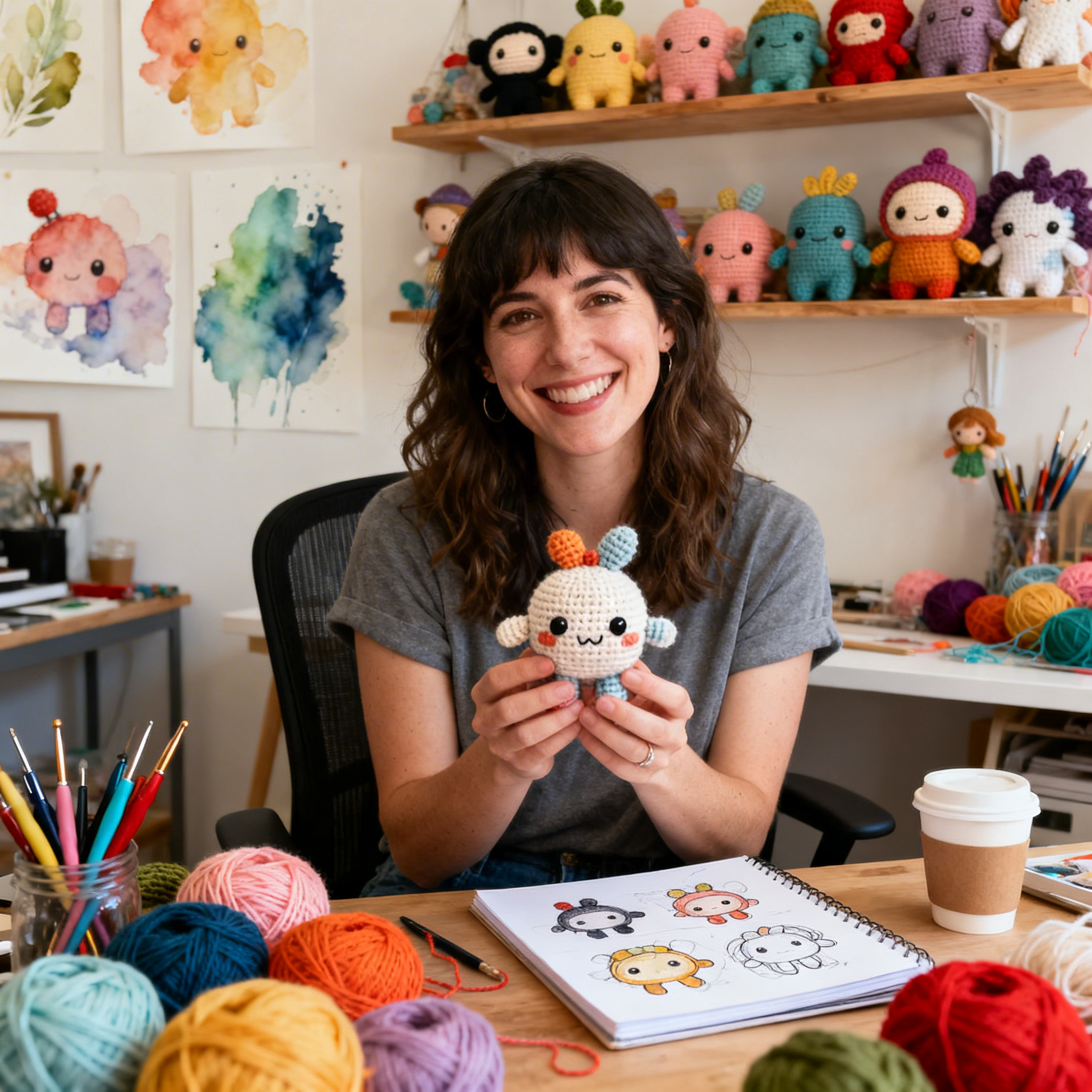
Clara Fern — Crochet Artist & Amigurumi Designer
Clara Fern is a crochet artist and amigurumi designer based in Austin, Texas. With 9 years of experience working with yarn and hook, she transformed a lifelong passion for handcraft into a creative mission: making amigurumi accessible, fun, and deeply rewarding for crafters of all levels.
Clara discovered amigurumi during a trip to Japan in 2017, where she fell in love with the art of bringing tiny characters to life through crochet. Back home in Texas, she spent years studying color theory, design principles, and advanced crochet techniques — developing her own signature style that blends kawaii aesthetics with original character design.
Through maclafersa.com, Clara shares everything she has learned — from choosing the right yarn and reading your first pattern, to designing fully original amigurumi characters from scratch. Her writing is known for being clear, detailed, and genuinely helpful, with no steps skipped and no secrets kept.
When she’s not crocheting, Clara enjoys watercolor painting, visiting local yarn shops, and drinking way too much coffee while sketching new character ideas.