Seasonal Color Palettes for Amigurumi: Spring, Summer, Fall, Winter
Color storytelling brings amigurumi to life. Choose colors that match the season you want to evoke, using a few core hues for harmony with a spark. Soft contrasts and bold accents work best—your amigurumi becomes a tiny, expressive scene rather than a flat figure.
Think about light through the seasons: Spring with fresh greens and blush pinks; Summer with bright yellows and ocean blues; Fall with warm oranges, browns, and burgundies; Winter with cool blues and bright whites. Pair one dominant color with a couple of supporting tones to keep the look cohesive and readable as a small artwork you carry with you.
How seasons change color mood
Seasonal lighting shifts subtly: Spring greens and blush for new growth; Summer yellows, sky blues, crisp whites; Fall pumpkin oranges, russet browns, olive greens; Winter icy blues, slate grays, and pale whites. Higher contrast suits spring and summer; fall and winter benefit from softer transitions. Align mood with the toy’s personality—brighter accents for playful pieces; muted tones for cozy companions.
When you’re deciding, picture a scene: a spring bunny hops through fresh grass; a summer starfish basks on sunlit sand; a fall owl nests among maple leaves; a winter penguin slides on chilly ice. Let the scene guide how you mix light and shadow in color.
Basic color contrast rules for your toys
Contrast is your friend for visibility and charm. Use a light color next to a dark one to make features pop, like eyes on a darker face or a beak that shines against a lighter head. Keep saturation in mind: highly saturated colors read vibrant on small toys; muted tones feel sophisticated. Don’t drown small details in muddy tones—let each feature breathe.
Limit the number of colors per toy to three or four. More colors can blur the character and stress the eye. If you add a surprise color, use it as an accent on a single stitch or small accessory so it reads clearly. Texture matters too; a tiny stitch of bright yarn can read as a spark without needing extra colors.
Test your combos by scanning from a distance. If the silhouette stays readable and the face remains expressive, you’ve hit the mark. If you can’t tell what color is where, simplify the palette or adjust the contrast. Simple wins make your amigurumi instantly appealing. Seasonal Color Palettes for Amigurumi: Spring, Summer, Fall, Winter help guide these decisions.
Turn theory into palette rules
Create a quick rule set you can follow every time: pick one season, choose one dominant hue, add one or two supporting tones, and reserve one accent color for small details. This keeps projects predictable and polished. For example, a Spring palette might be: light green as the main color, a soft pink as support, and a white accent for highlights. A Winter set could be navy blue as the base, icy gray as supporting, and a bright white for eyes or trim. Seasonal Color Palettes for Amigurumi: Spring, Summer, Fall, Winter can be invoked here to remind yourself of the framework.
Write these rules on a card or in your notebook. When you start a new amigurumi, you’ll reach for your card first, ensuring consistent mood across toys. If you want variety, rotate through the rules monthly, but keep a core set you always rely on.
Choose a spring amigurumi color palette
You want your spring amigurumi to feel fresh and alive. Start with a core color that feels like the season—light greens, soft pinks, or sunny yellows. This core anchors the piece and guides contrasts, accents, and skin tones for cohesion from head to toe.
Bring in contrast with a couple of complementary hues. Gentle contrast keeps the piece readable without shouting. Use one bold color sparingly as an accent to make eyes sparkle or a flower pop. The palette should feel balanced, like a well-curated bouquet where each bloom stands out.
Context matters. If your amigurumi is a character or animal, match colors to its story or scene. Write down exact hex values or dye lots to stay consistent across projects. Seasonal consistency helps build a recognizable signature.
spring amigurumi color palette with pastels
Pastels are spring’s staple. Start with a soft base—pale apricot for cheeks or ears and a cloud-like cream for bodies. Add a whisper of mint green or baby blue for outfits or accessories. Keep hues desaturated enough to let shading show without fighting the color.
Let the pastels mingle in small doses. Use one dominant pastel for the body, then two supporting pastels for accents and features. For flowers or foliage, pick one color for petals (like blush pink) and another for leaves (soft mint). The contrast should be noticeable but not bold.
Test the palette in your yarn. Pastels can shift under different lighting, so compare daylight and indoor lighting. If a hue reads off, swap to a nearby pastel that works better in your light. The goal is a harmonious spring-ready look that stays charming.
pastel spring crochet colors for flowers and skin
For flowers, choose two pastel tones that belong together. A pale peach for petals with a dusty rose accent keeps the bloom lively. Leaves can be sage or mint to complement without stealing focus. Use the lightest color on outer edges for a delicate feel.
Skin tones work best with peachy, creamy, or light beige hues. Keep shading subtle with gentle transitions; a rosy pink on cheeks reads lively without overpowering. Small color changes simulate light and shadow for a sunlit day.
Bind colors with frequent, small changes to mimic light. A tiny switch at the ear edge or a blush on the cheeks brings the piece to life.
Build a summer amigurumi bright palette
For summer, choose colors that make the piece pop. Start with a bold core like sunny yellow or bright turquoise, then layer two or three lighter or darker accents. Use small, high-contrast touches—coral, lime, or hot pink—to convey seasonal energy. Test swatches to ensure the palette reads lively up close and cheerful from afar.
Map colors to features: bold shade on hats, cheeks, or paws, with calmer colors for bodies or details. Repeating bright colors in small patches creates rhythm, while the calmer shade anchors the design. Use neutrals—cream or light gray—to give eyes a rest between bursts of brightness.
Keep a color log as you work to record skein numbers and lighting effects. This becomes a reliable reference for future projects and helps future pieces stay cohesive with your summer line.
beachy summer crochet colors for seaside looks
Seafoam, coral, and sunny yellow anchor a seaside vibe; add a sandy beige to ground the bright hues. White or pale gray can mimic sea spray and shoreline highlights for a coast-ready charm. This palette works well for beachy animals, shells, or whimsical sea-creatures.
Texture matters: a lighter shade for tiny stripes on a swimsuit or shell pattern adds playfulness without stealing focus. For a sunny look, lean into yellows and oranges; for a calmer coastal feel, favor blues and greens with soft neutrals. Test colors under natural light to see how they hold up in sun exposure.
Check yarn colorfastness in sun
Place swatches in direct sunlight for hours and compare with indoor swatches. If colors bleed or fade, switch to sun-stable options, especially reds and yellows which fade more quickly.
Select fall amigurumi autumn tones
Choose cozy, rustic colors—earthy teals and warm browns—to evoke pumpkins, leaves, and bonfires. Create the mood of a quiet autumn afternoon, with contrast that makes features pop, such as a dark chestnut body and a soft cream face.
Pick a few key hues and stick with them. A focal color, a secondary tone, and an accent keep the palette cohesive. Your style—cozy farmhouse or spicy harvest—will influence how you group the tones, but consistency matters when sewing eyes and leaves.
Consider mood: muted, dusty palettes feel calm; brighter fall mixes sparkle like autumn sunshine. If yarns skew warm, lean into oranges, olives, and creams. For depth, add charcoal or deep burgundy for shadows. The color choices shape the vibe more than you might think.
fall amigurumi autumn tones with warm hues
Warm hues bring comfort instantly. Browns, burnt oranges, and mustard yellows read as cozy by the fire. A warm brown body with a cream muzzle reads friendly and approachable—a perfect hug-worthy character.
Let textures do the talking. Combine smooth acrylic with fuzzy or tweedy yarns to add depth without changing colors. A simple stitch variation can enhance the autumn glow.
Mix small color pops—sage green or cranberry—as tiny accessories to keep the focus on the main figure. Use accents sparingly to avoid stealing the scene.
warm autumn crochet palette and textured yarns
Texture matters as much as color for fall. Start with warm tones—tan, caramel, pumpkin, spice—and layer a darker trim for definition. Yarn texture—boucle or tweed—adds depth without new colors. Small color nudges, like rust or olive, ground the character and keep the autumn vibe.
Autumn should feel tactile as well as visual; invite a gentle squeeze with yarn that reads cozy.
Blend shades with sample motifs
Weave warm tones into tiny motifs: a leaf, a pumpkin, a pinecone. Start with a leaf motif in a gradient from amber to chestnut to olive to learn how shades flow together, then apply the gradation to other parts for cohesion.
Keep scales small and repeatable. When you find a harmonious combo, reuse it across parts of your amigurumi for consistency. This repetition helps your project feel cohesive and finished.
Pick a winter amigurumi cool palette
Choose colors that feel crisp and cozy, staying cool but not icy. Base tones should read cool, with small bright pops to wake the design without overwhelming it. The goal is a calm, cohesive look with personality.
Imagine pale skies, icy blues, and soft grays to guide how dark or light each yarn should be. If the piece is small, you can push contrast a bit higher; for larger pieces, keep contrasts gentler for a soothing result. The right combination makes your figure feel like a small winter scene.
If unsure, start with three base colors and one accent. For example: cool gray body, pale blue shading, off-white highlights, and charcoal depth. Test on scrap swatches to ensure cooperation among colors. With a thoughtful palette, your winter amigurumi will look polished and inviting.
h3: winter amigurumi cool palette with muted shades
Muted shades keep the design quiet and refined—dusty blue, pale lavender, soft sage, and cool taupe. Use the muted base across the body, reserving richer hues for shading to add depth without breaking the serene mood. Balance is key: too many bold colors and the calm fades; too few and it reads flat.
Texture can let color do the talking subtly. A barely-there gradient or gentle variegation adds realism without overpowering the design. If you want a touch more warmth, add a small muted blush for cheeks or ears, but keep it restrained. The result is a cozy winter look that remains friendly and approachable.
muted winter crochet colors plus bright highlights
Bright highlights act like tiny sparkles on a frosted pane. In a muted winter scheme, use a single bright color sparingly to draw attention to a small feature—like the nose, scarf edge, or eyes. Keep the rest muted so the highlight reads clearly as a winter sparkle.
Apply the bright color in a small area with crisp edges and simple shapes to ensure it reads as an accent. If your amigurumi has a face, use the bright shade for a friendly expression. Remember: the highlight is an accent, not a flood of color.
Contrast faces and features clearly
Make facial features stand out with clear contrast. Use a lighter face against a darker body, or outline eyes and mouth with a darker stitch. Clean lines ensure expressions read instantly, even at a glance. A crisp, defined face makes winter characters feel confident and lively.
Create seasonal palette combinations for amigurumi
Discover simple ways to pair colors so your amigurumi look alive and balanced. Start with one main color that matches the character or mood, then add two or three supporting hues that won’t compete with it. Use a light-to-dark progression so the smallest detail gets its own pop without stealing the show from the main color. Think cozy and warm for winter, bright and fresh for spring. Pairing soft pastels with a bolder accent keeps things playful rather than shy. When testing combinations, lay swatches side by side and ask, Do these feel like they belong together? If yes, you’re on the right track. Seasonal Color Palettes for Amigurumi: Spring, Summer, Fall, Winter can guide these choices.
Next, bring texture into the palette. A single project can carry multiple textures—smooth, fuzzy, and ribbed yarns—so your color choices should respect that variety. If you use a fuzzy yarn for the body, keep the stripes or details in smoother yarns to prevent muddiness. You can mute a loud color with a neutral like warm gray or cream so the texture isn’t overwhelmed. The goal is harmony, not competition.
Finally, test with real-world use. Make small swatches in your top colorways and compare them under daylight, lamp light, and even phone light. You’ll spot clashes you didn’t notice on a color wheel. If a color looks off in one light, swap it for a closer cousin rather than forcing a perfect match. Keep a small, portable color card to improvise on the go without breaking your flow.
Mix seasonal palettes safely with simple rules
Start with one dominant season and add two supporting hues you love. For Spring, let one bright shade be the star and back it with two softer tones. For Summer, pick a sunny main and balance with cool neutrals. Fall loves deep, earthy tones—bring in one bold accent and a couple of muted mates. Winter is about contrast, so pick a crisp main plus a pair of rich, coordinating shades. These rules keep your amigurumi cohesive, even when you mix dramatic and tame hues. Seasonal Color Palettes for Amigurumi: Spring, Summer, Fall, Winter helps remind you of the framework.
Keep contrast and warmth in mind. A light body color with a dark eye makes details pop. If your main color reads warm, cool accents prevent heaviness. A quick grayscale check shows how bold the contrast really is. A simple test: step back and see if the silhouette reads cleanly.
Make seasonal sets for your shop or gifts
Bundle colors that tell a story, not just a stack. Spring sets: mint, blush, cream for garden party critters. Summer sets: sunshine yellow, turquoise, coral for beachy looks. Fall sets: rust, olive, cream for harvest-ready characters. Winter sets: navy, white, red for a classic, cozy vibe. Include mood notes and suggested characters to help buyers connect with ideas.
Label sets clearly so buyers see intent at a glance. Include notes on what colors evoke and what patterns they suit. Suggest a few patterns or characters to jump-start ideas. Keep bundles affordable with small skeins or scraps for testing ideas, encouraging experimentation without waste.
Label palettes with swatch cards
Create a compact swatch card for every palette. List the main color first, then the supporting hues, with a short note about mood or season. Print swatches small and include a card with a friendly instruction like Try these for a spring bunny. A visual guide helps shoppers imagine projects and reduces questions. Always include exact yarn weight and brand to ensure accurate replication.
Swatch cards also help you stay consistent. As you add palettes, use them as a quick reference to compare with your core palette. If a color in a new set doesn’t harmonize, rethink before publishing. This keeps your shop cohesive and easy to browse.
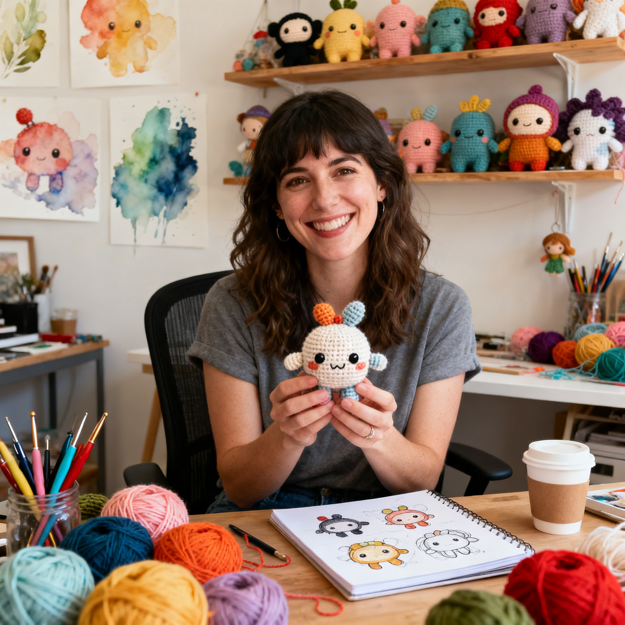
Clara Fern — Crochet Artist & Amigurumi Designer
Clara Fern is a crochet artist and amigurumi designer based in Austin, Texas. With 9 years of experience working with yarn and hook, she transformed a lifelong passion for handcraft into a creative mission: making amigurumi accessible, fun, and deeply rewarding for crafters of all levels.
Clara discovered amigurumi during a trip to Japan in 2017, where she fell in love with the art of bringing tiny characters to life through crochet. Back home in Texas, she spent years studying color theory, design principles, and advanced crochet techniques — developing her own signature style that blends kawaii aesthetics with original character design.
Through maclafersa.com, Clara shares everything she has learned — from choosing the right yarn and reading your first pattern, to designing fully original amigurumi characters from scratch. Her writing is known for being clear, detailed, and genuinely helpful, with no steps skipped and no secrets kept.
When she’s not crocheting, Clara enjoys watercolor painting, visiting local yarn shops, and drinking way too much coffee while sketching new character ideas.