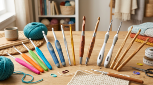
Color Basics for Inclusive Amigurumi Skin Tones
Amigurumi skin tones aren’t just one color. You’ll use a mix of bases, undertones, and shading to make every plush feel real. Start with a few reliable skeins covering a range from light to deep shades, then layer in undertones to reflect diversity. When you pick colors, think about how light hits skin in real life and how that translates to yarn. Your goal is a natural, believable skin look that still feels handcrafted, not a perfect photograph.
To begin, choose a core color that feels right for the character’s skin. Then add undertones—yellow, pink, olive, or blue—to shift the base. Blend in tiny amounts of in-between shades to smooth transitions. Don’t fear mixing. A test swatch on scrap yarn helps you see how the colors sit together in a small space. The most important part is how the colors work after you crochet, not just how they look on the skein.
Finally, think about light and shadow. Use lighter tones for areas that catch light and deeper tones for shaded spots. You’re not coloring a flat surface—you’re giving your amigurumi depth. Keep notes as you go: which undertone pairs with which main color, and where you used them on the figure. Clear notes save time on rework and help you repeat successful blends.
Understanding undertones and shade selection for amigurumi undertone and shade selection
Your first step is to map undertones. You might choose a base that looks warm with a pink or olive undertone, or something cooler with a blue or purple hint. When you test, place swatches side by side under the same light and compare how they feel as skin rather than as math. The right undertone makes the skin look alive, while a mismatch can make the figure look flat or off.
Shade selection is about the right ladder, not just the top rung. Pick a main shade for the bulk of the skin, then add a lighter shade for highlights and a darker shade for shadows. A simple rule: use shading to outline features softly, not to scream. You’ll often blend a tiny amount of the darker shade into the lighter one where you’d expect a natural shadow, like under the cheekbone or along the jawline. Keep a small palette handy and label each shade with its undertone so you don’t confuse them later.
When you’re choosing undertones, consider the character’s ethnicity, lighting in photos, and the yarn’s warmth. A yellow-based base can warm pink undertones; a cool base may need extra pink or blue to read correctly. Test, compare, and then commit. If a shade feels off, tweak by mixing in a neighboring hue. Small changes add up to big realism.
Value, saturation, and simple color theory for yarn shade blending for skin tones
Value is how light or dark a color reads. Blend value by layering light and dark shades. Start with your midtone for the bulk of the skin, then add a lighter shade for highlights on the bridge of the nose, cheek, and forehead. For depth, apply a darker shade under the chin and around the eyes. This creates a gentle, life-like gradient.
Saturation affects how vivid or muted your skin looks. If your base feels too bright, ease it with a touch of gray or desaturated brown. Conversely, a dull base can be revived with a warmer undertone. The trick is balance: keep the color lively but not shouting. You want the skin to glow softly, not gleam.
A quick color theory tip: pair a warm midtone with a cooler highlight and a slightly warmer shadow. Test on a scrap first, then transfer what works to your amigurumi. The goal is skin that reads as human, not a caricature.
Quick color wheel tips
- Use complementary pairs to avoid flat skin: a warm base with a cool highlight for depth.
- Keep at least two undertones in your toolkit; switch between them for lighting or character traits.
- Build a small, labeled palette of 4–6 shades per skin tone family for easy reuse.
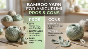
Matching yarn brands and fibers for skin tones
You want your amigurumi to look like real skin, and that starts with picking the right yarn. By choosing brands and fibers that behave well together, colors read true and stitches stay even. Test a brand by pulling a few rows and making a mini swatch in your typical stitch. If the dye reads dull or the fabric feels stiff, try another brand or fiber. Matching yarn brands for skin tones is a practical first step, not a final guess.
Next, consider shade depth. Some brands dye with cooler undertones, others with warmer glow. Compare several yarns side by side in familiar light. For tan or deep skin tones, seek richer browns and subtle reds rather than flat beiges. Choose a brand family that reads with the same warmth across lots and dye lots to keep skin-tone colors cohesive.
Texture matters. A smooth, tightly spun fiber can read differently from a fluffy, plied one even with the same colorway. If your goal is seamless blending between tones, pick a brand with consistent dye application and a fiber that pools predictably. You might prefer silk blends for lighter tones or cotton for deeper ones.
How fiber and texture change perceived color
Fiber choice changes how a color appears. A bright skein may read differently on smooth nylon than on fuzzy wool. Test the same color on different fibers to see which reads closest to your idea. Texture affects light reflection too: a slick yarn catches light and can appear lighter, while a fuzzy blend softens edges and can shift color toward warmer or cooler notes. Plan your color progression with fiber and texture in mind for a balanced finish.
Use brand swatch cards and compare dye lots for matching yarn brands for skin tones
Brand swatch cards help you compare how different brands read on skin tones before you commit. Lay several swatches side by side in the same light and note each one’s read. Save pictures and dye lots to keep looks consistent if you replace a skein later. If possible, buy small amounts from several brands to test in your favorite stitch pattern and lighting.
Dye lots can shift color slightly. Double-check dye lots before buying more. If you must mix lots, blend two or more skeins to create a smooth transition for a uniform skin tone across projects.
Note on dye lots and fiber differences
Dye lots matter. Even within the same brand, a new batch can read differently. If you notice a shift, adjust shading by adding a neighboring shade from the same lot. Fiber differences matter too. Wool reads differently from cotton or acrylic. When mixing fibers for texture, keep color progression visible and coherent. Always test on a small piece first.
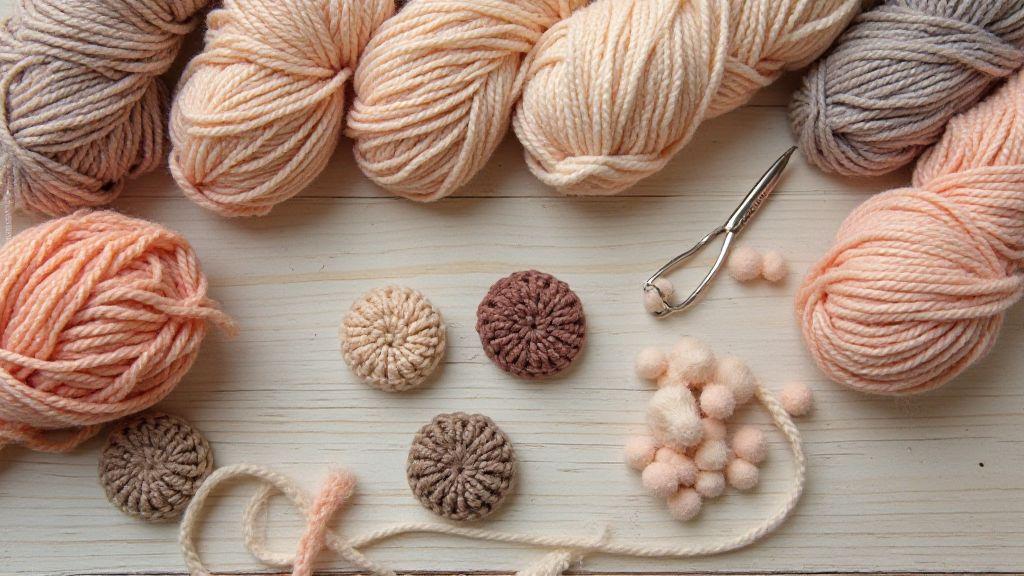
Mixing Yarns to Create Custom Shades
Mixing yarns lets you dial in hues so characters feel real. Start with a base color close to your target shade, then add subtle tints and shadows with small amounts of contrasting fibers. Keep your palette small at first and document blends with ratios and intended use (cheek, palm, neck). Compare swatches under natural light and adjust: if too yellow, add pink or peach; if dull, wake it with peach or golden brown. Record how undertones shift and where each blend works best.
Techniques:
- Held together: twist two strands side by side for an immediate, unified color—fast and forgiving for beginners.
- Plied blends: spin yarns so the fibers weave into a single, multi-toned strand for deeper texture.
- Single-strand blends: let colors remain distinct for delicate streaks, freckles, or subtle depth.
Small batch tests and gradual adjustments help you avoid overshooting. Crochet 2–3 inch swatches, compare under your final lighting, and log results. Build a reliable recipe you can reuse for future characters.
Record ratios and names
Keep a simple log: base color, added tint, exact ratio (e.g., base:highlight:shadow = 80:15:5), yarn brands, color numbers, and intended use. This becomes your personal palette for quick recreation later.
Building Diverse Palettes and Inclusive Crochet Doll Skin Palettes
Crafting amigurumi that feels real means offering options that cover every skin shade you might want. A thoughtful range makes dolls more relatable and projects more joyful. Think of your palette as a toolbox: the right mix helps you match real skin in tiny stitches. By building diverse palettes, you unlock new stories with every doll.
When you choose colors, you’re choosing inclusivity. Your stash becomes a bridge between characters and crafters who see themselves in your work. A well-rounded palette saves time during the project and creates consistent results across dolls. Your amigurumi will feel more personal, and your process will feel more intentional.
Start with a range from light to dark and add midtones for inclusive amigurumi skin tones
Begin with six core shades that cover pale to deep. You want clean, distinct tones that blend smoothly with midtones. Start with a light shade with a soft, warm undertone, then a fair shade with beige, a mid-light shade, a true medium with warmth, a medium-dark, and a deep tone. This range gives a solid foundation for shading and highlights.
Introduce midtones to bridge core shades. Midtones help fade from light to dark without harsh lines, enabling soft sculpting of cheeks, the bridge of the nose, and under the chin. Label your six core shades clearly in your notes or color cards to keep shading consistent across projects.
Include warm, cool, and neutral options to aid amigurumi skin color matching tips
Warm options add sunshine and softness; cool tones provide balance and lifelike depth; neutral shades act as flexible bases. Use all three to adapt to lighting and character. Warm undertones are yellow, peach, or apricot; cool undertones lean toward blue, pink, or purple; neutral tones include cream, beige, or taupe for subtle shading. Start with a warm or neutral base and add a cool midtone if you need more depth. If a doll looks too yellow, add a cooler shade; if flat, add warmth.
Begin with six core shades
Anchor with a six-shade set: light warm, light neutral, mid-light, true medium, deep midtone, and a deep shade. Pair each core shade with one or two midtones to soften edges and keep blends natural. Document how you use these shades to repeat success across projects.
Practical Swatching and Lighting Tests: selecting yarn colors for diverse skin tones
Build a small palette focused on warm and cool variations. Swatches act as a color lab: test under natural daylight and indoor bulbs, compare, and label by brand, dye lot, and lighting. Let swatches sit in your workspace to observe shifts with weather and time of day. Create small coordinated sets for light, medium, and deep variants to ensure inclusivity and reduce repainting.
Photograph, compare, and view swatches at different sizes. Take clear photos under each lighting condition, and review at 50%, 100%, and 200% zoom to catch subtle shifts. Build a quick reference library of base tones that read consistently across sizes and lights.
Multicultural Amigurumi Color Guide and Community Resources
This guide keeps things practical: real swatches, trusted sources, and quick notes you can reference while stitching. Collect palettes from makers representing diverse skin tones, test swatches side by side, and label them (e.g., golden-undertone, cool-olive). Build a personal kit of go-to palettes and shade charts, with permissions and credits to share resources respectfully.
Find palettes, tutorials, and shade charts from diverse makers for inclusive amigurumi skin tones
Seek palettes from a broad mix of makers. Save color codes and brands, test on swatches, and note how lighting affects reads. Jot down tweaks that helped depth or warmth. Descriptors like cool slate or golden honey help translate real skin into stitches. If a tutorial uses a brand you don’t own, note the closest match from your stash and compare side-by-side. Over time, build a library of shade charts and tips that celebrate different skin tones.
Share swatches and ask communities about matching yarn brands for skin tones
Share actual swatches with the community and invite feedback on undertones. Be specific about lighting, swatch size, and shade numbers. People will respond with practical tips—like which base to twist with which shade for depth or how humidity affects color. Save and log these tips to reuse later. Asking for color-name clarifications or equivalents helps you learn faster. When you find a match, record the exact yarn base, color code, and blends as a repeatable recipe to share.
Credit sources and note permissions
Always credit original makers when you use specific palettes or tutorials. If you’re unsure about sharing paid resources, ask for permission or rely on freely shared materials. Clear credits motivate creators and foster generosity. When you share your own palettes, include a note on your process so others can learn and adapt respectfully.
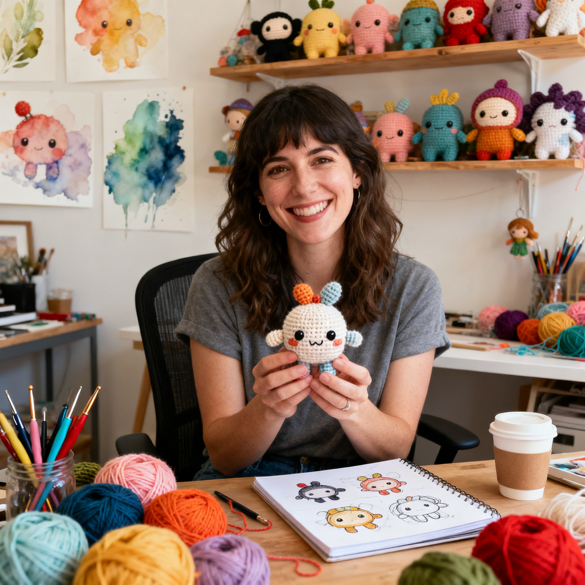
Clara Fern — Crochet Artist & Amigurumi Designer
Clara Fern is a crochet artist and amigurumi designer based in Austin, Texas. With 9 years of experience working with yarn and hook, she transformed a lifelong passion for handcraft into a creative mission: making amigurumi accessible, fun, and deeply rewarding for crafters of all levels.
Clara discovered amigurumi during a trip to Japan in 2017, where she fell in love with the art of bringing tiny characters to life through crochet. Back home in Texas, she spent years studying color theory, design principles, and advanced crochet techniques — developing her own signature style that blends kawaii aesthetics with original character design.
Through maclafersa.com, Clara shares everything she has learned — from choosing the right yarn and reading your first pattern, to designing fully original amigurumi characters from scratch. Her writing is known for being clear, detailed, and genuinely helpful, with no steps skipped and no secrets kept.
When she’s not crocheting, Clara enjoys watercolor painting, visiting local yarn shops, and drinking way too much coffee while sketching new character ideas.