How to Use Neutral Colors to Make Your Amigurumi Pop
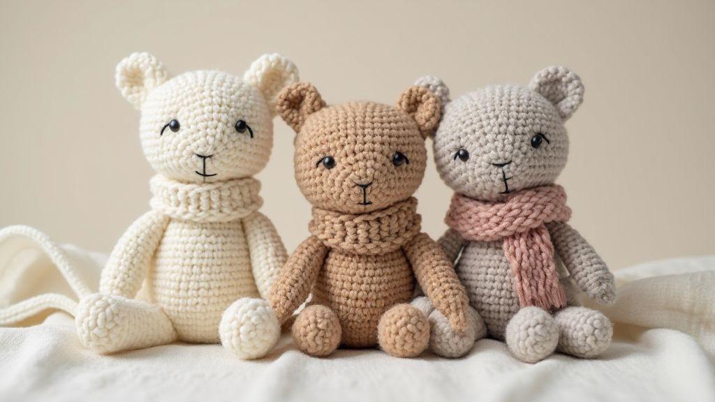
When you use neutral colors, you set a calm base for your amigurumi project. Neutrals like creams, beiges, grays, and soft browns mix easily, preventing clashing shades. Layer texture and shape to give personality without shouting color. This approach keeps designs timeless and versatile so your amigurumi fits on any shelf or toy collection.
A neutral canvas helps details shine; with a subdued base, stitching, eyes, or tiny accessories become the focal point. Your crochet work looks cleaner and more polished with less color noise competing for attention. If you want cozy, classic vibes, neutrals are your best friend.
If you’re unsure where to start, think neutrals like a blank page. You can always add pops later with small accents. This lets the piece grow without color overwhelm and keeps projects adaptable and stylish.
Start with three simple neutrals
Begin with three basic neutrals you can mix and match: a warm ivory, a soft taupe, and a cool gray. These offer enough contrast to shape faces, bodies, and features without overpowering the design. They stay friendly to light and dark fabric scraps, so you won’t hunt for the right shade.
As you work, use these neutrals as your baseline. If you need a touch more depth, add a tiny hint of a fourth neutral—like pale sand or a muted latte—but keep it subtle. The palette should feel cohesive, as if the amigurumi came from one thoughtful color story.
Test color in your stash by comparing swatches under the same lighting. You’ll quickly see which neutrals read as warm or cool and how they pair with your yarn texture.
Test swatches under natural light
Always test swatches under natural light. Natural light reveals true tones and helps you avoid surprises when crocheting in daylight. Lay the swatches on a clean surface and view from different angles to see how fibers catch the light and whether any color shift happens when stretched.
If a swatch looks too stark or flat, tweak with a touch of warmth or coolness without abandoning the neutral plan. Testing under real light shows how your amigurumi will look in a sunlit room or near a window.
Keep a small swatch card and label each neutral with its mood—calm, cozy, or modern. This habit speeds decisions on future projects and keeps your color system consistent.
Use neutral color palette for amigurumi to plan tones
Planning tones with a neutral palette keeps your composition balanced. Map out light and shadow on the toy’s curves, using neutrals to define features without loud interruptions. This helps you craft expressive faces and friendly bodies, where shape and stitch texture do the storytelling.
Balance neutrals and accents in amigurumi
You want a toy that looks inviting, not noisy. Start with base neutrals—soft beiges, creams, or pale grays—as the quiet backdrop. Next, choose bright accents to catch the eye at just the right moment. Use a pop color sparingly—for a nose, a button, or a tiny bow. The goal is a clean stage where focal points stand out without competing with the rest of the color story.
Weave with consistent neutrals on the main body. One or two accent colors can shine on small areas like ears, paws, or a hat. This creates visual rhythm that guides the eye from the main form to the details you want noticed. Test a few swatches on scraps first to ensure the accents feel intentional, not random.
Balance isn’t just about color. Consider texture—neutrals can dominate the surface while accents bloom in pattern. A smooth neutral body contrasted by a bumpy stitch in your accent color creates a playful, cohesive feel. Keep the silhouette calm, letting accents speak where you want attention.
Follow a 70-20-10 ratio rule
Aim for a calm base with just enough contrast. Use 70 percent neutral tones for the main areas, 20 percent for secondary colors that add depth (like shading or inner ears), and 10 percent for the bright accent that makes a feature pop. Keep a notebook of your color plan, sketch layouts, and mark the 70-20-10 zones to avoid overloading any area.
When choosing the 10 percent accent, pick something that sings against your neutrals. If neutrals are cool, pair a warm accent for contrast; if neutrals are warm, a cooler accent will wake the piece. The goal is gentle, intentional contrast.
Place accents on focal areas
Direct attention to where it matters most—near the face or hands. A bright nose or a contrasting color on the paws pulls the eye to expressive parts. Test placements from a distance and adjust as needed to maintain a calm overall look.
Contrast and accents for neutral amigurumi
When you design neutral amigurumi, balance calm tones with small sparks of life. Choose a truly neutral base (warm beige, cool gray, or creamy off-white) and brighter accents that don’t overwhelm. A touch of blush, a darker stitched eye color, or a subtle feature near the eyes can anchor expression without breaking the calm vibe.
Use contrast to guide attention with light and shadow rather than bold color explosions. Lighter areas against mid-tones create gentle focal points. Stitch density can deepen shadows and add depth, while looser stitches keep areas airy. Test in different lights to ensure the piece reads as friendly and cohesive in real-life settings.
Low contrast for soft looks
Low contrast works for a lullaby-soft feel. Pair nearly identical tones so there’s no harsh color jump; use subtle differences for features, keeping eyes, nose, and mouth barely there but readable. Sparing accents—like a seam in a slightly different shade—help keep the softness intact.
Soft photography benefits from this approach: diffuse lighting and simple backgrounds keep the focus on the cozy form.
High contrast to draw the eye
High contrast introduces a touch of drama. Use a bright accent against a deep base or a dark feature on a light body to guide the gaze. Bold accents can highlight the eyes, scarf, or ear details. Use outline stitches in a darker color to frame the face for added definition without overcomplicating the look.
In photos, high contrast pops with simple backgrounds. It can become a signature style for your amigurumi.
Contrast and accents for neutral amigurumi with small pops
When neutrals are calm but you want a tiny zing, add small pops in limited places—one or two spots max. Place the pops where they’re seen first: on the chest, in the eyes, or as a small mouth line. This restrained approach yields personality without breaking the neutral harmony.
Audiences notice the restraint. The small pops provide character while keeping the piece versatile for cozy homes or playful displays.
Neutral yarn color combinations for amigurumi
Neutral yarns give you a polished base that helps shapes stand out. Start with a main neutral (cream, taupe, or soft gray) and build others around it. Neutrals pair well with different textures, letting stitches shine without competing hues. Test a small swatch to see how light affects color in daytime versus evening.
Undertones matter. Cool grays read crisp and modern; warm taupes feel cozy and welcoming. For tiny animals, a cool base can keep features crisp, allowing eyes and details to pop. For a softer look, warm ivory or beige reads gentle and approachable. Use one main neutral and two supporting neutrals to add depth without overpowering the design.
Mix warm and cool neutrals to achieve modern depth. Start with one dominant neutral and add a cooler or warmer partner. Avoid two warm neutrals that read too similar and don’t overdo the cools, which can feel stark. A third, slightly different neutral can tie the look together without breaking harmony.
Pair neutrals with a single pastel for a gentle focal point. Choose a pastel that complements the neutral undertone—pale blue for cool neutrals or soft peach for warm neutrals. Keep the pastel as an accent, not the main color, so the shape stays the hero. This is great for beginners.
Shading texture with neutral yarns to add depth
Layer texture to bring depth to neutrals. Start with an even base stitch, then add tiny shadows with subtle variations in stitch density. The goal is for yarn color to do the talking while texture adds form. Pair a warm beige with a cooler gray to create natural-looking depth.
Use varying stitch heights to shape light and shadow. Taller stitches push surfaces outward and cast longer shadows; shorter stitches tuck yarn closer and keep shadows tight. Alternate rows of standard height with a few taller rows in recessed areas for a natural gradient.
Add simple color gradients to enhance depth without stealing attention from the form. Fade gradually from light ivory to soft wheat to simulate light catching on curved edges. Map your light source in your head and test gradients on a swatch before applying to the whole piece.
Choosing neutral tones for crochet toys
Neutral tones give crochet toys a timeless feel. Start with creams, beiges, grays, and soft browns to create a calm base that lets textures and stitching shine. Neutrals act as a clean canvas that highlights tiny eyes or noses without competing colors. They also help your toys fit into any room and stay appealing as trends shift.
Experiment with shading within neutrals: light cream with warm taupe for depth, or cool gray offset by ivory for contrast. Match tones to character age and style to keep the toy readable and friendly. For baby characters, softer neutrals work best; for whimsical styles, add slightly deeper neutrals for personality. A small tonal shift can change the whole vibe.
Choose non-toxic, colorfast dyes
Safety first. Use non-toxic, colorfast dyes so your toy stays vibrant without transferring color. Test dyes on scraps and wash a sample piece to ensure color remains true after washing. Label dyes and keep receipts to verify safety.
For child-safe crochet toys, select neutrals that are soothing and easy to clean. Limit bold accents to one or two tiny features to keep the toy calm and approachable. Check stitching regularly and ensure dyes don’t bleed after washing.
Highlight features with neutral palettes
Neutral palettes give your amigurumi room to breathe, letting eyes and texture pop. Start with a main neutral for the body and reserve brighter accents for eyes, cheeks, and small details. Neutrals are flexible for any character and work well with varied textures.
Lighting changes how neutrals read. Soft light creates gentle gradations; harsh light reveals every stitch. Place highlights and shadows thoughtfully to keep the silhouette readable from any angle. Your neutral palette acts as the quiet conductor guiding every element.
Use darker neutrals for eyes and nose
Darker neutrals define eyes and the nose without overpowering the face. A deeper taupe or charcoal-gray works well for eye sockets and the nose tip. Keep surrounding areas slightly lighter to make the eyes pop and soften edges with a tiny glow for realism.
Add blush or trims sparingly
A touch of blush or a fine trim can add life, but restraint is key. Use a light pink or peach sparingly for cheeks. A narrow trim along an ear or neck seam can add detail without breaking neutral harmony. Align blush with lighting direction for depth.
Color contrast tips for amigurumi photos
Stage shots like a mini-film. Choose a backdrop that lets your toy’s yarn tones shine. Soft contrasts keep details readable without shouting. Calibrate cameras to preserve true hues and test a few backdrops to see what makes textures pop.
Muted backdrops emphasize your amigurumi. Soft greys, dusty blues, or warm sand surfaces keep the focus on your piece, with props used sparingly for whimsy. Soften light with natural sources or diffusers to maintain even texture without harsh shadows.
Using neutrals to make amigurumi pop in styling
Neutrals aren’t dull; they’re a quiet backdrop that lets your yarn colors sing. Start with a simple base color for backgrounds or props, then bring in textures to add dimension without stealing focus from your piece.
Pair props that are neutral in tone but varied in texture for visual interest. Use consistent color families across displays to create a cohesive gallery-like look. This helps buyers focus on your craft, not the scene, and reinforces a premium feel.
Style with simple, calm props
Calm props create space for your amigurumi to breathe. Pair a soft neutral backdrop with a single understated prop—like a plain wooden stand or a linen cloth—to anchor the display without stealing attention. Keep textures varied but patterns quiet.
Coordinate outfits and shelves
Coordinate neutrals with gentle textures to unify displays. Let each amigurumi wear a distinct accent color while keeping backdrops cohesive. A consistent setup across pieces improves photography and presentation, helping viewers recognize your brand and craft.
Remember: How to Use Neutral Colors to Make Your Amigurumi Pop is a great reminder you can weave into your process. This approach keeps designs clean, balanced, and expressive, so you can enjoy the craft and share something you’re proud of.
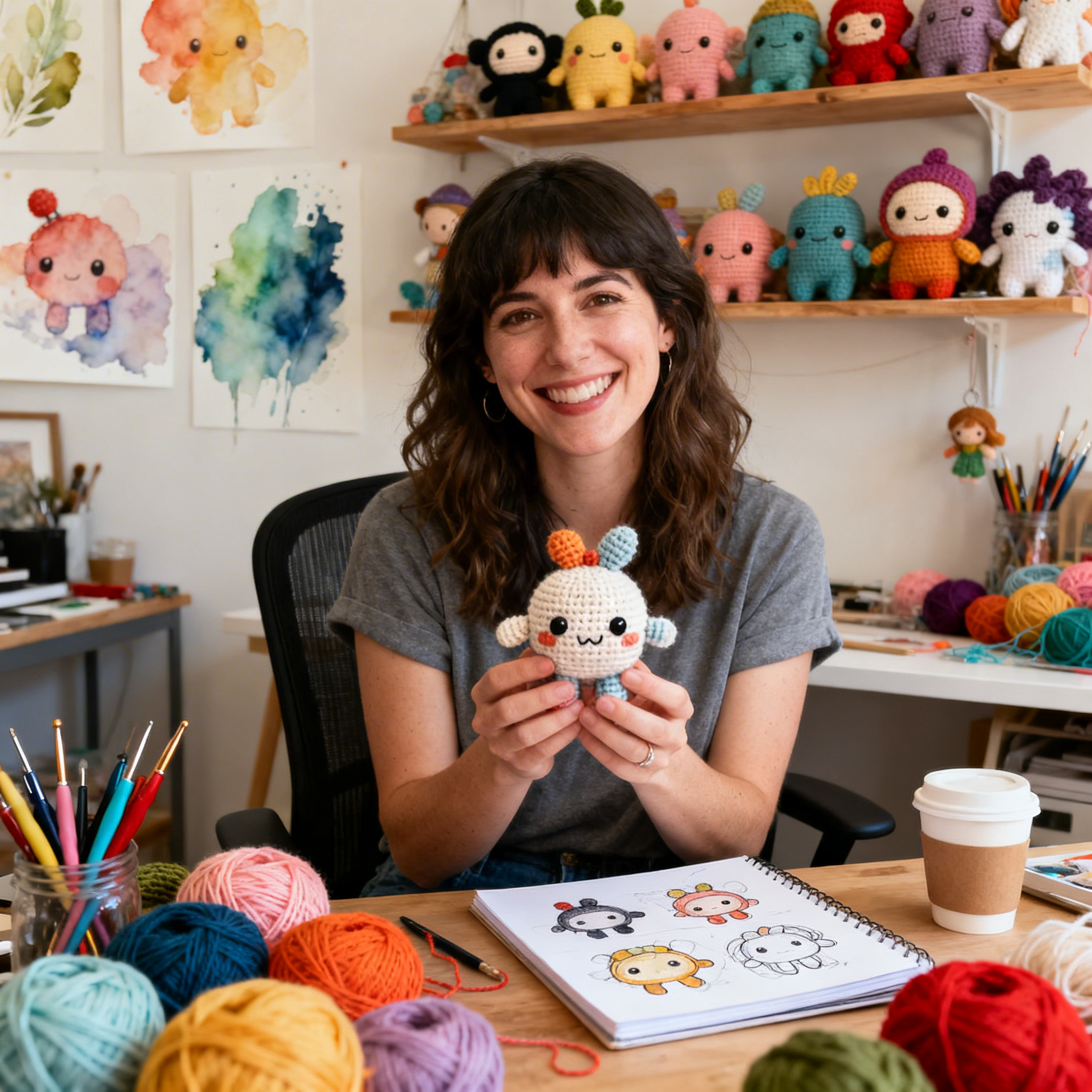
Clara Fern — Crochet Artist & Amigurumi Designer
Clara Fern is a crochet artist and amigurumi designer based in Austin, Texas. With 9 years of experience working with yarn and hook, she transformed a lifelong passion for handcraft into a creative mission: making amigurumi accessible, fun, and deeply rewarding for crafters of all levels.
Clara discovered amigurumi during a trip to Japan in 2017, where she fell in love with the art of bringing tiny characters to life through crochet. Back home in Texas, she spent years studying color theory, design principles, and advanced crochet techniques — developing her own signature style that blends kawaii aesthetics with original character design.
Through maclafersa.com, Clara shares everything she has learned — from choosing the right yarn and reading your first pattern, to designing fully original amigurumi characters from scratch. Her writing is known for being clear, detailed, and genuinely helpful, with no steps skipped and no secrets kept.
When she’s not crocheting, Clara enjoys watercolor painting, visiting local yarn shops, and drinking way too much coffee while sketching new character ideas.