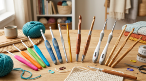
Color theory for amigurumi basics
Color sits at the center of personality in amigurumi. You’ll express mood, character, and story with every stitch. Here are practical steps—from using a color wheel to picking tones that sing together—for a cohesive look where every part supports the character you’re bringing to life.
Color theory isn’t a mystery—it’s a toolkit you can apply right away to avoid clashing strands and keep contrasts readable in tiny details. By pairing the right hues, you ensure your amigurumi communicates the vibe you want—whether cozy, bold, or whimsical. You’ll gain confidence mixing tones that feel intentional, and your patterns will pop when color choices align with the story you want to tell.
Remember, color is a language you already know. With a simple framework, you’ll pick colors that are harmonious, eye-catching, and true to your character. You’re about to turn a ball of yarn into a character with personality and charm.
Use the color wheel
The color wheel is your best friend for quick decisions. Map your main color, then find neighbors for harmony or opposites for punch. Start with one color that fits your character’s vibe, then look at nearby hues to keep the blend soft or opposite hues to make features pop. Think of it as selecting a wardrobe that mixes well without clashing.
Test your choices in tiny swatches before you commit. Place two or three colors together on your amigurumi and ask, Does this feel balanced or loud? If something bothers you, shift one hue on the wheel. You’ll learn which neighbors sing together and which clash, and you’ll notice how light or dark versions affect readability on curves and stitches.
Practice will give you instinct: which pairings read as a single character, and which accents catch the eye. The wheel is a practical map you’ll use for eyes, ears, bellies, or outfits. You’ll feel more confident knowing color choices align with your design goals.
Pick warm or cool tones
Warm tones—red, orange, yellow—feel friendly, energetic, and inviting. They’re great for cozy or bold characters. Cool tones—blue, green, purple—read as calm, clever, or mysterious, ideal when you want a thoughtful or serene vibe. Decide which direction fits your character’s mood and back it with a few test stitches.
Consider your character’s environment and story. A sunny forest habitat reads warm; a moonlit lakeside reads cool. You can mix warm and cool accents for depth, but aim for balance: one dominant tone, 1–2 supporting tones in the same temperature family, and small pops of the opposite to keep interest.
If unsure, list three words for your character (soft, brave, curious), then pick a temperature that matches those feelings. You’ll end up with a palette that feels intentional rather than random. Your amigurumi will look designed, not stitched together by chance.
Apply a simple wheel
Take a straightforward approach: choose your main color, then two supporting colors using the color wheel. Place the main color at the center and pick one adjacent color for harmony and one complementary for a pop. If your main is warm, lean on cool accents for balance, or reverse that to spark interest. This keeps your palette cohesive without overthinking every stitch.
Try a quick example: a friendly fox. Main color: warm orange. Nearby warm shade for shading, and a cool cream for the belly and highlights. Finish with a dark brown or charcoal for eyes and nose. The wheel-guided trio reads unified, cute, and easy to reproduce across the figure.
Choosing skin tone yarn for your amigurumi
Choosing skin tone yarn sets the character’s memory and mood. Pick a hue that blends with your overall palette so the amigurumi photographs and handles well. Consider lighting—what looks warm in daylight may read flat under indoor bulbs. Your goal is a natural skin tone that doesn’t shout toy.
Texture matters: smooth, tight yarn shows tiny details clearly, while slight variegation adds character without muddying the face. Stay within a skin-tone family—peach, beige, taupe, olive—and shift lighter or darker with lighting. Subtle undertones (pink, yellow, rosy) can breathe life into the face. Experiment with 1–2 tones to create depth without losing unity.
Also check comfort: the yarn should be pleasant to touch, durable, and washable. This affects how true your character feels and how long you’ll enjoy stitching.
Check undertones and shade range
Undertones map to real skin without flattening the piece. Compare swatches under your typical lighting. Warm undertones (yellow, peach) read friendly; cool undertones (pink, olive) can read serious or artistic. Look for a shade range with base color plus lighter and darker options to craft shading with simple changes in yarn and stitch. Your goal is depth, not contrast for its own sake.
Test by placing swatches beside your main skin tone. Notice how undertones interact with eyes, hair, and clothes. A subtle undertone shift can dramatically improve realism. If one swatch makes eyes pop but mouth look flat, you’ve found balance: enough contrast to define features while keeping unity.
Test samples on your light
Testing on light fabric or light-hand technique helps judge true color. Dye lots shift sizing and tension, so crochet a small sample to see how it sits. Compare daylight and lamps to reveal different personalities. If the lightest sample reads washed out, go a shade darker; if it looks too pink, shift cooler. You want a natural look that holds under photography.
Keep notes on shade name, undertone, and stitch count. This saves time on future characters and keeps color choices consistent. If unsure, trust your eyes—the best color is the one that makes your amigurumi feel alive to you.
Compare swatches side by side
Lay swatches side by side to see how tones shift with light and how undertones carry through stitches. The side-by-side view helps identify harmonies and clashes. Highlight the swatch that reads most naturally and keep it as your primary skin tone; others become tools for shading cheeks, noses, or shadows under the jaw.
Harmonious color combinations amigurumi
You want balance and inviting warmth, not chaos. Start with analogous color sets—colors next to each other on the color wheel. They blend naturally. Pair soft teal with blue-green and mint highlights for a gentle look. If you want depth, keep tones in the same family and add a tiny neutral (cream or light gray) to give the piece room to breathe. This approach keeps your character friendly and intentional.
For a bolder touch, try monochrome palettes: one hue with its light, middle, and dark versions. You’ll get depth without chaos. If your main color is purple, add a whisper of lavender and deep plum for highlights and shadows to maintain unity while adding dimension.
If you’re feeling adventurous, test a dominant color with small accents. Let one color carry the main mood, then choose two tiny pops for eyes, ears, or buttons. This keeps your piece lively yet controlled. For example, a soft coral body with coral accents and a single bright lime focal point reads playful and intentional.
Try analogous or monochrome sets
Analogous sets create a soothing flow. Choose three to four hues in a row and layer them light to dark. Use the lightest for the torso, a mid tone for limbs, and the darkest for accents. Monochrome sets rely on one color family for depth, which yields a polished, cohesive look. Blues create a soft, water-like vibe—great for bedtime companions or ocean-themed characters.
Use complementary colors for crochet toys
Complementaries—colors opposite on the wheel—deliver high impact with minimal effort. Use one bold body color and a small amount of its opposite for accents. Keep the dominant color across most of the piece and reserve the contrasting color for features like a bow, mouth stitch, or eyes. Test your contrast in a few places and adjust until you find the playful balance you want.
Pair bright teal with warm coral for photos that pop. For a sleepy read, forest green with soft peach reads cozy. Test across different areas to nail the balance.
Balance hue and value
Color value—the lightness or darkness of a color—shapes how your amigurumi feels. Start with a solid base color and add lighter or darker tones for shading and texture to keep the look dimensional. A lighter body with darker seams often helps the form pop while staying friendly and approachable.
Map light and dark areas before crocheting. Think about natural shadows and mirror that in yarn choices. A gentle gradient from head to toe or front to back adds life without color noise.
Color contrast for amigurumi details
Color contrast makes your amigurumi sing. Start with a base color and choose one or two accents at opposite brightness levels. This keeps details readable from distance and in photos. Test palettes in natural light, as screen colors can fade in daylight. Pair a soft pastel body with a bold eye color to elevate focal points.
Direct attention with contrast: darker shadows under a light nose, or a bright lip against a muted cheek. If the background is busy, boost contrast around the figure. Neutrals can amplify color drama—outline eyes with a dark shade to heighten expression. Begin simple, then layer in more contrast as you grow confident. Expressive detail should read clearly in photos and in person.
Write down color rules to stay cohesive: eyes two shades brighter than skin, mouth warmer than lips, trim equals secondary accent. Start with one bold feature and keep the rest subtle to anchor the design.
Make eyes and features pop
Eyes are the heart of your character, so give them the spotlight. Use a bright iris and a darker outline. A small white highlight adds life, but keep it clean and minimal. If the base fabric is busy, simplify eyes with a solid color and clean edge. Test iris shading in photos to ensure a smooth gradient reads as a single color from afar.
Other features—mouth, cheeks, eyebrows—should stand out enough for photos but not overwhelm the face. A warm lip on cool-toned skin reads lively; a cool lip on warm skin feels fresh. Outline features slightly with a darker shade to maintain definition. If using embroidery for tiny details, match thread weight to fabric. Crisp, well-spaced eyes and features pull focus.
When choosing eye color, consider emotion: bright blue or green for curiosity or playfulness; deep brown or black for calm and grounded. Sparkles or star highlights add whimsy without overwhelming color balance.
Use trims to increase contrast
Trims define edges and add rhythm. A contrasting edge helps separate the figure from the background and gives a finished look. Choose trims that repeat one accent color so the eye moves smoothly. A border around the face or limbs sharpens the overall impression. If your palette is bold, a neutral trim can calm the look while guiding attention to key areas.
Think in layers: base color, mid-tone for accents, trim color to tie it together. Use trims to emphasize pose or expression—an arc of seam line can imply a smile. Test trims on a small swatch first to avoid overwhelming your primary colors.
Balance is key: too many borders fragment the design; too few can feel unfinished. A single well-placed trim around the neck or cuffs can add contrast without crowding the look. Trims should feel deliberate, like punctuation at the end of a sentence.
Keep detail legible
Detail reads best with sufficient contrast between neighboring colors and clear boundaries between sections. Avoid tiny, close-toned details that fade; give them a thin outline or small contrast edge so they stay visible in photos and in person. If a detail disappears at arm’s length, switch to a bolder color or add a subtle outline. Aim for features at least two shades apart from their surroundings to prevent blending in.
Pick best yarn colors for your amigurumi
Color choices set the mood. Start with a main body color and a few accents for eyes, cheeks, or tiny accessories. Balance is your friend: too many colors can look busy, too few can feel flat. Think about your character’s vibe—cute, bold, cozy—and choose a palette that supports that feel. If unsure, begin with a simple trio: a main, a secondary, and a highlight; you can add a fourth color later for tiny details if needed. Remember, your yarn colors aren’t just looks—they tell a story in every stitch.
When selecting colors, consider how they interact under different lights. A shade that looks right in daylight can shift under indoor lighting. Lay skeins side by side under your usual lamp to judge it. If you’re unsure, test small swatches with the same yarn to see how shades harmonize before committing to a full project.
Plan for future tweaks too. If you like swapping color blocks or adding tiny accents later, choose a palette with compatible hues. Borrow inspiration from nature, toys, or a favorite picture book to find winning pairings. Keep your final silhouette in mind—bold outlines may shift perception of lighter shades.
Choose washable, colorfast yarns
Look for yarns that stay bright after washing. If unsure, choose colorfast fibers or test bleed after several cycles. Washability saves you from surprises when your amigurumi becomes a favorite toy. Texture matters too: a soft-to-touch yarn that holds color well gives you a durable finish. For beginners, a smooth, medium-weight acrylic or cotton blend is forgiving. If you prefer natural fibers, mercerized cotton is strong and colorfast but watch for frizz in finer stitches. Always swatch and wash before committing.
Check dye lot ranges and care instructions. You don’t want one skein fading after a wash while another stays vibrant. Favor brands with colorfast ratings and repeatable colors across lots. For larger projects, buy an extra skein to cover any dye lot differences.
Match dye lots for consistency
Consistency comes from sticking with the same dye lot for the main areas. If you must switch dye lots, blend gradually with a transition stripe. Label skeins and lots clearly, so you can restock the exact shade later. If you’ve started, finish the current section before switching and compare the new lot against the existing color. A mismatch can be softened with the new color used sparingly or by adding a coordinating shade to smooth the transition. Extra dye-lot checks save time and ensure a seamless look from head to toe.
If you’re new, build in extra dye-lot checks. It’s a small step that saves rework later and helps your amigurumi read as cohesive.
Label skeins and lots
Keep skeins organized with clear labels showing color name, color code, and dye lot. Place labels on the outside for quick reference. When a project ends, store leftovers for future characters. Clear labeling keeps your momentum smooth and minimizes color confusions.
Accent colors for your amigurumi characters
Accent colors can make your amigurumi pop, shaping mood and telling a story with a shade or two. Use bold, clean choices that align with your overall color plan so your piece reads clearly from across the room. Accents should feel deliberate: a punchy blue or warm coral on a calm base draws attention to the face or paws without overwhelming the body.
Limit accents to one or two to keep the design clean. If the base is calm, one bright accent can draw the eye. If the base already has two lively tones, keep accents minimal to prevent chaos. Limiting accents also simplifies comparing yarns under different lights and speeds up decision-making.
Accents show personality: a bright yellow nose can read sunshine, a teal scarf can signal calm. Placement matters—tiny highlights on ears, paws, or a button can anchor the look. Test how accents read in photos and under different lighting to ensure they stay true to the character.
Limit accents to one or two
One bright accent can convey energy without overpowering the main body. If you use two, reserve them for eyes and a small accessory. Too many accents muddy the message, so keep it tight for faster decisions and consistent results across pieces.
Use accents to show personality
A bright yellow nose can signal sunshine and optimism; a deep teal scarf can read as thoughtful. Align accents with your character’s story: a shy creature may use gentle pinks or mint, while a bold character might wear neon pops or high-contrast stripes. Placement reinforces traits—heart on a cheek or a stripe along a sleeve. Small repeats of the accent color strengthen the trait without overwhelming the design.
Place accents with purpose
Place accents where they deliver impact. Eyes are a natural focal point; a color there changes the mood. A colored stitch near the mouth can signal mischief or cheer. Accessories—like a hat, scarf, or collar—offer ready-made accents without crowding the main color. Let placement tell your story.
Balance your accents with lighting. Some shades pop under daylight, others glow under warm indoor light. You’ll craft photos that show your work well and keep the amigurumi looking intentional from every angle. Your pieces will feel finished and ready to share.
Seasonal color palettes for amigurumi
Seasonal color palettes set mood and bring toys to life. Color isn’t just pretty shades; it’s telling a story with your stitches. Plan a palette to guide how the toy is perceived, how it feels to hold, and how photos will look. Think of color as the voice of your character—clear, warm, or playful—and use it to reinforce your design. This saves time at the loom and yields toys that feel cohesive and intentional. How to Choose a Color Palette for Your Amigurumi Character can be seen as a guiding question across seasons.
Your palette should reflect the season. Spring calls for fresh, hopeful tones; summer benefits from brighter accents; fall adds depth with rich hues; winter or holidays invite deeper neutrals with festive highlights. Practicing pairing hues helps you learn what combinations sing and which quiet the piece. A well-chosen palette helps photos pop and makes your amigurumi stand out online or in person.
Remember, harmony is the goal. If unsure, start with a base color for the body, then add 1–2 accent shades and a small highlight. As you gain confidence, you can introduce subtle shifts—slightly warmer or cooler tones—to give personality while preserving unity.
Use spring pastels for soft toys
Spring pastels evoke fresh rain and new shoots. Core shades like pale pinks, baby blues, mint greens, and butter yellows create gentle, friendly bodies for teddy bears, bunnies, or small birds. Keep accessories slightly brighter to add depth while keeping the overall softness. Test swatches on scrap yarn to confirm the final look before committing.
Pair a base pastel with one or two lighter accents; a white highlight can make eyes pop and add a spark. Spring pastels photograph well in natural light, reducing harsh shadows and keeping textures visible. For gifts, these colors convey comfort and sweetness, making your amigurumi instantly endearing. A simple color wheel approach—main pastel, complementary soft shade, and a tiny contrasting dot—keeps the design cohesive and lively.
Try warm fall and holiday tones
Warm fall tones bring coziness and nostalgia: pumpkin, amber, olive, burgundy. These colors suit pumpkins, foxes, and rustic characters, giving a grounded vibe. For holiday pieces, consider crimson, forest green, gold, and slate blue for a festive yet tasteful look. Balance: keep the body earthy and let accessories sing brighter fall hues. Use contrast to highlight features like faces and ears. A touch of metallic or bright accent can imply sparkle without stealing focus from the character itself. Warm palettes photograph well indoors, helping your photos pop on social media or in listings.
Seasonal design can feel like a vignette. Hold the palette to your character’s place and time, so it reads as handmade, cozy, and intentional. If gifting, these tones offer a sense of place and time that feels thoughtful.
Match palette to season
Match your palette to the season. Spring means light, soft hues and gentle contrasts; summer favors brighter accents; fall anchors pieces with rich, earthy tones and small glows of warmth; winter or holidays blend deep neutrals with festive highlights. Ensure all colors relate to each other and to the story you’re telling with your character. How to Choose a Color Palette for Your Amigurumi Character fits into these seasonal guidelines as a practical reference.
Color psychology in amigurumi design
Color can make your amigurumi feel cozy, energetic, or calm. Choose hues on purpose to guide how someone feels when holding your creation. Define what you want your character to express—sweetness, boldness, whimsy—and let color set the first impression before the stitches. Bold accents draw the eye; softer tones provide a gentle vibe. Use color to tell a story as the opening act, not just the backing.
Color also affects how other details read. A bright hat on a pale body pops; the same hat on a dark body may blend. Balance contrast to keep features clear without shouting. You can highlight eyes, smile, or unique accessories with color. Remember: color is a tool you can test and adjust. If a palette feels flat, swap one hue for a brighter shade or a softer one to revive interest without breaking harmony.
Design with an audience in mind: color shifts with light, so plan by choosing hues with similar undertones or add a metallic thread as a small spark. Thinking ahead helps your piece read well in photos and real life alike. The right colors help your craft shine in display and play. How to Choose a Color Palette for Your Amigurumi Character becomes a guiding question you revisit as you design.
Pick colors to set mood
Your palette should set a mood before anyone sees the face. For warm, friendly vibes, lean into honey yellows, soft oranges, and creamy beiges. For calm, soothing feels, purples, blues, and soft greens work well. For bold, energetic charm, choose high-contrast combos like teal with coral or mustard with navy. Start with one dominant color, add two supporting colors, and finish with a tiny accent to keep things lively but not chaotic. This structure helps your amigurumi convey emotion at a glance.
As you experiment, you’ll see some colors sing together and others clash. That clash isn’t always bad, but know when to push and when to pull back. If a color makes your eyes jump, swap it for a gentler shade or add more neighboring color to mellow the contrast. Remember: your goal is to guide the viewer’s feeling, not overwhelm them. A simple swap can shift the entire mood of your creation. If you’re unsure, revisit How to Choose a Color Palette for Your Amigurumi Character as a reference for mood-driven hues.
Consider age and audience
Think about who will love your amigurumi most. For kids, go bright with high-contrast colors that are easy to recognize and touch. Large patches of primary colors read as friendly and approachable. For teens or collectors, explore nuanced tones—muted blues, earthy greens, or jewel tones—that feel sophisticated yet handmade. Always prioritize safety: avoid small detachable color bits on pieces for youngsters and choose yarns that handle repeated hugs and washes well.
If you’re crafting for a specific character or story, align colors with that narrative. A pirate bear might wear red and black for drama, while a shy fox might wear warm browns and soft oranges to convey gentleness. Your choices reveal the character before it speaks.
Choose mood-driven hues
Pick mood-driven hues to anchor your design’s feeling. For a cheerful mood, choose bright pinks, sunny yellows, and candy blues. For mystery or fantasy, go with deep purples, midnight blues, and forest greens. For comfort and coziness, warm neutrals—cream, taupe, and caramel—do the work. Start with one mood color and build around it with two complementary shades plus a small accent to keep the mood lively without breaking it.
As you test, place colors side by side in the exact spots you’ll sew them. Photos help you see how the mood translates in real life, not just in your head. If the piece feels heavy, lighten one hue; if it looks flat, add a brighter accent. Your final palette should feel intentional, like every stitch was chosen to tell the same story. And if you’re ever unsure, remember the guiding question: How to Choose a Color Palette for Your Amigurumi Character?
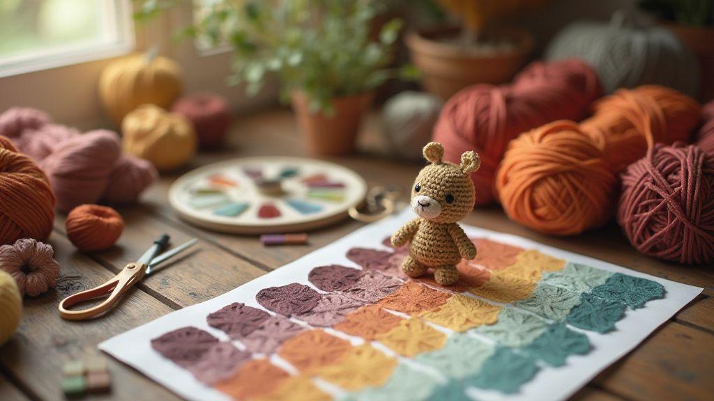
Amigurumi color palette tips you can use
Make a swatch board first
Hold your colors in your hands before stitching. Create a simple swatch board with your chosen yarns and basic stitches to see how each shade reads next to the others. Keep the board flat and labeled for quick comparison of contrast, warmth, and brightness. Test different pairings—warm pink with cool teal, deep brown with sunny yellow—so you feel the mood of your character before you begin. Your swatch board becomes a color dashboard guiding every choice as you shape your amigurumi. To answer the broader question of How to Choose a Color Palette for Your Amigurumi Character, this board is your visual reference.
You’ll notice how texture shifts the look too. A matte yarn reads softer than a shiny one, and a plied yarn can deepen color in shaded areas. Lay swatches side by side under the light you’ll actually use for photos to anticipate final behavior. If you’re unsure, start with a small reference project to test your eye for eyes, noses, and tiny details. Your swatch board becomes personal and practical, not just pretty.
Photograph choices in daylight
Natural light is your best tool for judging true color. Shoot your swatch board and early samples near a window or outside on a cloudy day for soft, even light. Avoid harsh sun that washes out tones. Use a neutral background so hues stand out without competing shadows. Consistent timing helps you compare options, and daylight photos become part of your color decisions, not just documentation. How to Choose a Color Palette for Your Amigurumi Character can be guided by these daylight practices to ensure your palette reads in real life as well as on screen.
As you photograph, learn how your camera handles color and how the dye sits on the fiber. If you notice drift between the board and stitches, adjust lighting or white balance and run a quick test shot. The goal is for your final amigurumi to look right in real life, so take the time to check the palette under real conditions.
Adjust before you stitch
Before you loop your first stitch, review your palette with a critical eye. Revisit your swatch board and daylight photos, then tweak. Swap a shade that reads too bright against a quieter color, or add a muted tone to soften a harsh contrast. Small adjustments—like a warmer cream instead of stark white—can dramatically shift mood without changing the core idea. You want harmony that supports the story you’re telling with your amigurumi. If you’re unsure, remember the overarching guide: How to Choose a Color Palette for Your Amigurumi Character.
When you adjust, consider the character’s personality and function. A shy creature might use gentle, low-contrast colors; a bold adventurer could wear brighter accents. If detailing uses multiple colors, ensure accents pop without stealing attention from the main form. Your board, daylight checks, and final test stitches all come together to keep stitches cohesive as you sew. How to Choose a Color Palette for Your Amigurumi Character remains a practical lens as you refine.
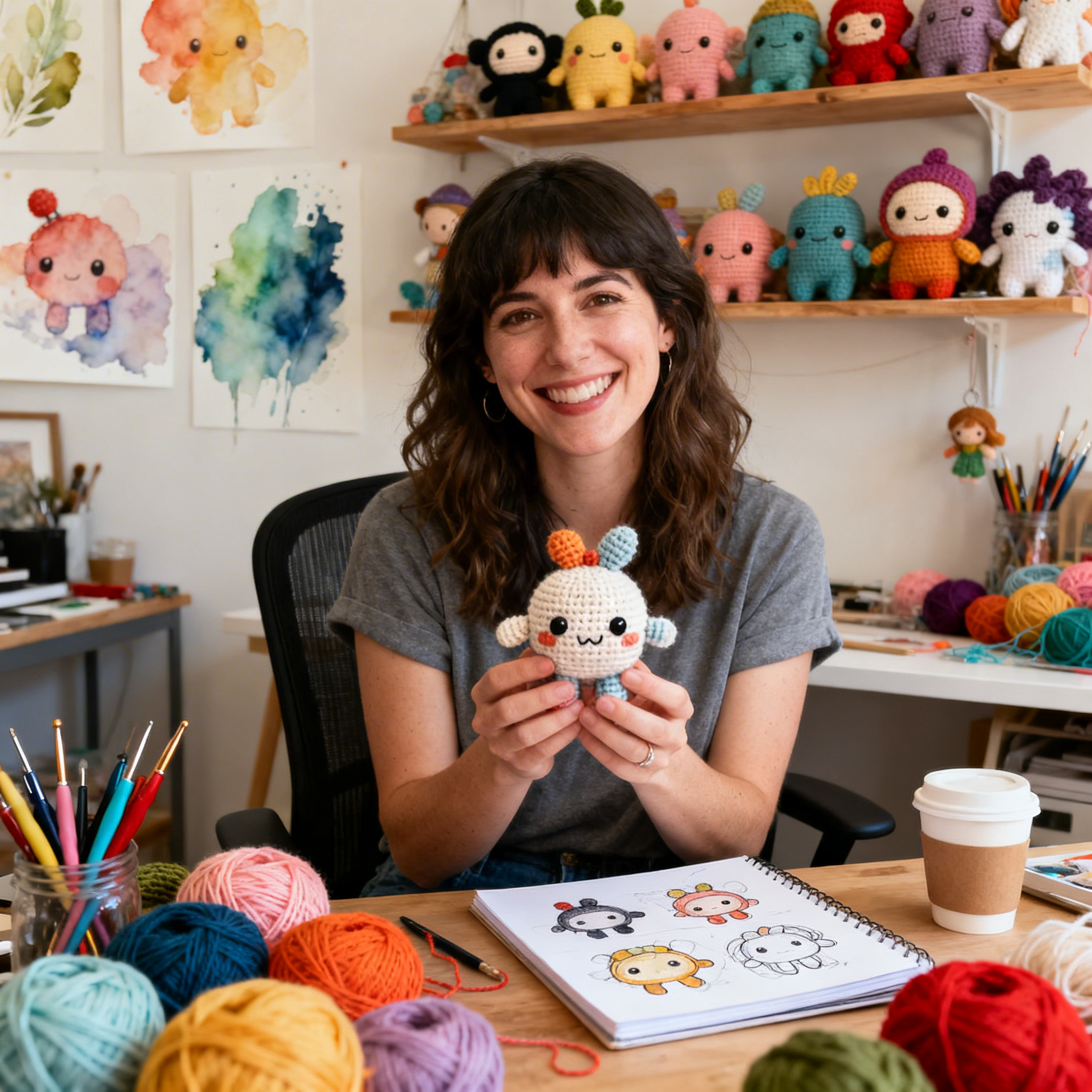
Clara Fern — Crochet Artist & Amigurumi Designer
Clara Fern is a crochet artist and amigurumi designer based in Austin, Texas. With 9 years of experience working with yarn and hook, she transformed a lifelong passion for handcraft into a creative mission: making amigurumi accessible, fun, and deeply rewarding for crafters of all levels.
Clara discovered amigurumi during a trip to Japan in 2017, where she fell in love with the art of bringing tiny characters to life through crochet. Back home in Texas, she spent years studying color theory, design principles, and advanced crochet techniques — developing her own signature style that blends kawaii aesthetics with original character design.
Through maclafersa.com, Clara shares everything she has learned — from choosing the right yarn and reading your first pattern, to designing fully original amigurumi characters from scratch. Her writing is known for being clear, detailed, and genuinely helpful, with no steps skipped and no secrets kept.
When she’s not crocheting, Clara enjoys watercolor painting, visiting local yarn shops, and drinking way too much coffee while sketching new character ideas.