Color wheel basics for amigurumi
Your color choices can make or break a toy’s feel. The color wheel is a quick guide to harmony, contrast, and mood. When starting a new amigurumi, think of the wheel as a map that helps you pick yarns that look together without fighting for attention. Small swaps can change the vibe—a warm peach for a friendly face, or a cool blue for a calm belly. With the wheel in mind, you avoid muddy blends and end up with clean, playful pieces that photograph well.
Understanding the wheel lets you plan ahead. For a cozy, inviting character, lean into analogous colors—yellows, oranges, and light reds sit side by side. For a bold, striking look, push toward complementary pairs like blue and orange or purple and yellow. Reading colors as relationships speeds your yarn choices and makes amigurumi appear intentional and polished. Color theory isn’t a mystery: mix lighter and darker shades to add depth, and spot clashes before you crochet the first stitch. The goal is cohesive yet lively pieces; texture and small color pops make the design memorable.
How the wheel guides your yarn choices
The wheel guides you to harmony when picking yarn. Choose adjacent tones for a soft, unified look, or opposite colors for a bright punch. If your main color is a soft mint, add a tiny coral accent to spark interest without stealing the show. This approach keeps your amigurumi eye-friendly and easy to photograph.
The wheel also helps you plan shading. You don’t need a ton of yarn to get depth—just switch one shade slightly lighter or darker. A subtle gradient from head to toe or a warm highlight on the belly reads as intentional art rather than random scraps. Color choices aren’t just about looks—they affect how your piece reads in daylight and indoors. Test your colors in a few lighting setups. Warm colors pop in bright light, while cooler tones stay calm. This awareness helps you craft amigurumi that stays appealing wherever it lives.
Primary, secondary, and tertiary colors
Primary colors are the building blocks: red, blue, and yellow. They often serve as main pops or face features. Secondary colors—orange, green, and purple—appear when you mix primaries and work well for clothing accents or secondary features. Tertiary colors are the smooth in-betweens, like red-orange or blue-green, helping you blend without harsh lines.
Practical use: a primary-red nose can pair nicely with a blue body for clear contrast. A green shirt with a yellow hat keeps things cheerful and readable from across the room. Tertiary colors soften bold contrasts and keep the design cohesive. Experiment in your head before stitching: purples and teals create a magical vibe; warm primaries with light secondary accents give a sunny, approachable look.
Quick wheel tip for your projects
Think in threes. Pick a main color, a secondary accent, and a tiny highlight. For example, a mint body with coral accents and a cream highlight feels lively yet approachable. This simple rule speeds your crochet sessions and keeps you from overthinking.
Build harmonious color palettes for amigurumi
Color bridges your amigurumi’s mood and charm. A cohesive palette makes stitches feel intentional, so your pieces read as belonging to the same family.
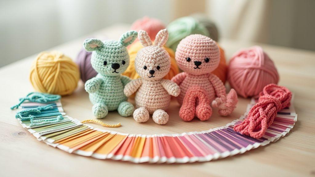
Analogous sets give a gentle, cohesive look: peach, coral, and soft pink create a soothing gradient ideal for cozy amigurumi. Triads offer balance with a playful energy: three colors evenly spaced on the wheel provide contrast without chaos. Use a dominant color and pull two supporting colors from the triad for details like ears, cheeks, and paws.
Easy palette rule to follow
Keep your palette to three core colors and two neutrals. Use one main color, one secondary for accents, and one highlight to make features pop. The two neutrals—cream and gray—form the foundations, helping every stitch breathe. If unsure, default to an analogous set, then add a triadic pop on small details for personality.
Use complementary colors in amigurumi
Complementary colors sit across from each other on the color wheel (blue and orange, red and green, yellow and purple). Pairing them makes your toy pop without feeling loud. Start with one main color and add a high-contrast partner for small details like a bright button or bow. Consider where eyes land first: a soft blue body with a warm orange nose draws attention exactly where you want it. Test on scraps first to avoid a busy look. Balance is key—one bold complementary pop often suffices.
Spot complements on the color wheel
Look for pairs that sit straight opposite on the wheel. Use complements for accents such as eyes, cheeks, or pockets to help features read clearly from a distance and up close. A single complementary touch can elevate the whole piece.
Balance warm and cool accents
Mix warm and cool tones to keep amigurumi from feeling flat. A warm main color with cool accents creates pleasing tension, while a cool main color gains warmth with a bright accessory. Test by imagining the wheel across your design as you crochet.
Simple contrast trick
Add one bold accent against a softer body. A dominant color with a single bright complement for a small feature creates a clear focal point with minimal effort. You can switch accents later for a quick refresh—keep most of the palette calm and let one element stand out.
Choosing yarn colors for amigurumi
Choosing yarn colors is where your character truly comes alive. You’ll want colors that pop enough to define shapes but stay cohesive so the piece reads as intentional. Consider the character’s mood, setting, and tiny details; picture how colors will read in small rounds before grabbing the skein.
End use matters: for a child, bright, easy-to-see contrasts work well; for keepsakes, subtler tones that blend softly may be preferable. Color choices should align with pattern scale and yarn shine. Start with a base color and add one or two accents, then adjust as you test in your pattern’s small rounds. Color choices also affect texture perception: glossy yarns can highlight features, while matte or fuzzy yarns soften details. Test a few color-ups side by side to see how they read on your hook.
Check dye lots, fiber sheen, and texture
Color consistency matters for a seamless finish. Always check dye lots before buying or joining skeins. Buy extra skeins from the same lot for large areas. Compare skeins side by side and swap if needed. Fiber sheen changes how a yarn reads—shiny yarns pop details, while matte yarns soften edges. Texture matters too: smooth yarns show crisp stitches; fluffy or textured yarns can blur fine details. Consider the pattern’s scale and test a swatch to see how color, sheen, and texture work with your pattern. Check for color bleeding by washing a swatch first.
Match color to pattern size and detail
Pattern size changes how color reads. Tiny amigurumi with small facial features benefit from high-contrast colors; bigger patterns can support more nuanced shading. Balance big color blocks with fine details for a cohesive look.
Yarn pick checklist
- Check dye lots and buy extra skeins from the same lot.
- Test dye fastness with a wash to prevent color bleeding.
- Compare fiber sheen and choose based on how you want details to read.
- Match color choices to your pattern’s size and detail level.
- Lay out colors side by side to ensure cohesion before starting.
Create depth with color in amigurumi
Color isn’t just about pretty yarn. Plan how colors sit together to give depth and presence. Start with a main color and two to three accents so the field color dominates while accents guide the eye. Color acts as a map for the viewer’s gaze, moving from body to face or paws without shouting.
Experiment with warm and cool combos. A warm pink body with cool mint eye detail creates instant contrast. You don’t need loud contrasts to add depth; a slightly darker seam shade can read as dimensional. Test swatches in different lights; aim for harmony with a touch of drama, not a rainbow explode.
Color is mood. Soft lavender reads gentle; deeper teal feels adventurous. By balancing tone, brightness, and saturation, your amigurumi gets personality. When color feels intentional, the finished piece looks ready for a story.
Work with value shifts, not just hue
Value shifts (lightness to darkness) create highlights and shadows without extra yarn. Start with a base color, then add one shade lighter and one shade darker for subtle depth. Use lighter shades on raised areas and darker shades in recessed areas. Keep transitions smooth; blend with a touch of the base color if needed. This makes your piece read as three-dimensional, even in flat light.
Layer midtones, highlights, and shadows
Layer midtones as your main color, then add highlights along the top edges and shadows under the chin or behind the ears. Use shadows that are a shade or two darker than the midtone for believability. Practice on a simple head or paw first to master the balance. The right combination makes your toy feel tactile and alive.
Depth tip for faces and limbs
For faces, add a subtle midtone across the cheeks, with a hint of highlight on the forehead and nose bridge. A small shadow under the chin defines head shape. On limbs, darken the inner curves slightly to emphasize roundness. Keep edges soft on ears or paws to avoid flattening the form.
Amigurumi color contrast tips
Color choices shape how your amigurumi feels. Start with a main color and plan tiny details that will draw the eye. If your base is pastel, bold accents create a clear focal point. High-contrast around eyes and mouth reads clearly from a distance. Balance is key—one bold detail is often enough to deliver impact without shouting.
When to use high versus low contrast
- High contrast helps facial expressions read clearly from across the room. Use it on eyes and mouths for clear mood.
- Low contrast suits cozy, gentle characters. A softer overall look reads calm and suitable for display in soft light.
Make features read from a distance
Outline eyes or mouths with a slightly darker shade or a defined edge. The face becomes legible even on a crowded shelf. The yarn texture can require bolder contrast, so adjust accordingly. A simple 60-30-10 color rule helps: 60% base, 30% secondary, 10% accent. This keeps the look balanced and guides attention to key features.
Color psychology for amigurumi
Color affects how your amigurumi feels to the viewer. Color sets mood, signals personality, and guides attention. Choose colors with intention, and your crochet toy becomes a story in hue. Color is a quiet voice—soft tones whisper calm, bright tones shout energy, and muted shades hint sophistication. A few core colors let them do the talking.
Color choices track mood and age. For toddlers, high-contrast combinations grab attention; for older kids, richer tones with softer contrasts feel stylish. For collectors or adults, deeper color stories with subtle shading can be very appealing. Use warm colors to feel inviting and cool colors to feel calm or magical. You can blend these by adding a warm accent to a cool base, or vice versa, to fit your character.
Pick hues to set mood and personality
Choose hues that reflect the personality you want. Soft pinks, peach, and cream read shy and sweet; bold primaries or saturated greens and blues read brave and energetic. Layer your choices: main color sets the mood, secondary supports it, and an accent adds a spark. Test quick swatches in different lights to see how mood shifts with lighting.
Choose colors by age and audience
Different audiences react to color differently. For toddlers, high-contrast blocks aid visual tracking; for older kids, richer tones with softer contrasts feel more fashionable. For collectors or adults, deeper color stories with subtle shading can be very appealing. If giving as a gift, consider the recipient’s favorites and avoid colors tied to negative memories. Balance brightness with rest to avoid overstimulation.
Mood color guide for toys
- Bold & energetic: red, orange, bright blue
- Calm & cozy: soft pink, peach, cream, pale blue
- Playful & whimsical: mint, lavender, sunny yellow
- Earthy & natural: olive, tan, forest green, taupe
Choose a mood first, then pick colors that fit. Your eyes will thank you, and your amigurumi will read with the exact personality you intend.
Amigurumi color combinations that work
Color palettes shape how your amigurumi feels. Start with mood—dreamy pastels for gentle creatures, bold primaries for energetic pals. Layer in accents to bring depth; tiny details should pop against the main color. Contrast helps features stand out, even in tiny stitches. Group colors into a small set and stick to it to keep the project cohesive. Don’t fear experimentation; swap hues for a fresh look without remaking the whole toy.
Test color harmony under daylight and crafting lights, as what looks right can shift with illumination. Color consistency matters when using multiple skeins—compare them side by side and note any differences. Tiny tweaks, like changing ear lining from pale pink to peach, can change the feel dramatically. Keep notes in your project folder so you can recreate a look later.
Color Theory for Amigurumi: The Basics Every Crafter Should Know
The Color Theory for Amigurumi: The Basics Every Crafter Should Know guides how you approach hue, value, and saturation in toy design. Start with the color wheel to build harmony; use analogous sets for cozy looks and complementary pairs for pops. Decide on a dominant color, two supporting shades, and a small highlight to keep things readable in small rounds. Test colors in different lights, test dye lots, and lay out skeins before stitching. Remember that color influences mood, scale, and texture perception. With practice, you’ll craft amigurumi that read as intentional, polished characters with a story told in color.
Color Theory for Amigurumi: The Basics Every Crafter Should Know in Practice
- Use the color wheel to build harmony, contrast, and mood.
- Favor analogous palettes for warmth, complementary for impact, and triads for lively balance.
- Keep a simple three-color core plus neutrals to maintain cohesion.
- Test under multiple lighting conditions to ensure colors read as intended.
- Match color choices to pattern size and detail for readability.
- Use value shifts (light/dark) to add depth without increasing color count.
- Implement gradients with careful striping or marling for smooth transitions.
- Carry or slip stitch carried yarns to blend color changes cleanly.
- Document dye lots, sheen, and texture to keep color consistency across projects.
Color Theory for Amigurumi: The Basics Every Crafter Should Know is a helpful reference to keep on hand as you experiment. The more you practice, the quicker you’ll learn which hues read best on your hook.
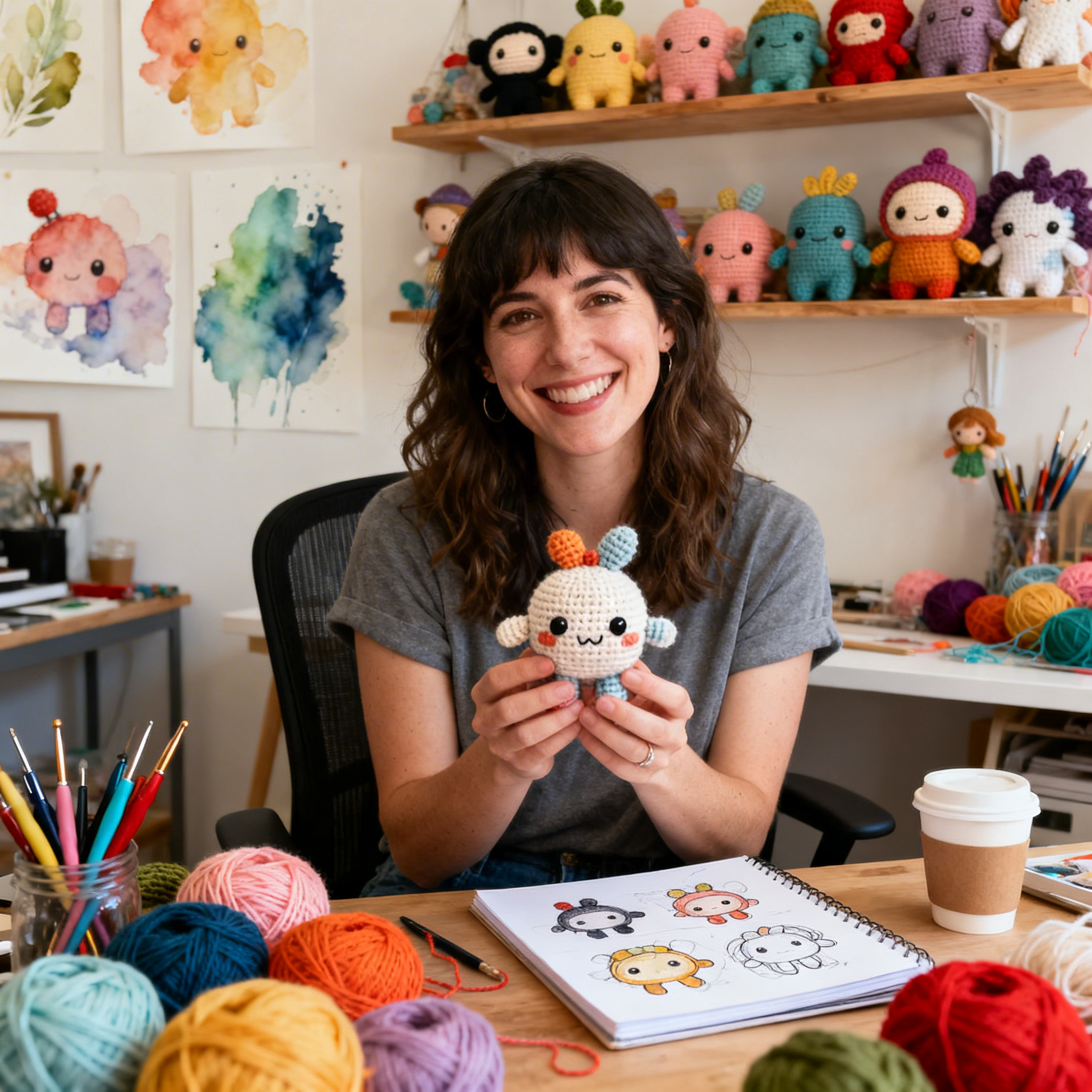
Clara Fern — Crochet Artist & Amigurumi Designer
Clara Fern is a crochet artist and amigurumi designer based in Austin, Texas. With 9 years of experience working with yarn and hook, she transformed a lifelong passion for handcraft into a creative mission: making amigurumi accessible, fun, and deeply rewarding for crafters of all levels.
Clara discovered amigurumi during a trip to Japan in 2017, where she fell in love with the art of bringing tiny characters to life through crochet. Back home in Texas, she spent years studying color theory, design principles, and advanced crochet techniques — developing her own signature style that blends kawaii aesthetics with original character design.
Through maclafersa.com, Clara shares everything she has learned — from choosing the right yarn and reading your first pattern, to designing fully original amigurumi characters from scratch. Her writing is known for being clear, detailed, and genuinely helpful, with no steps skipped and no secrets kept.
When she’s not crocheting, Clara enjoys watercolor painting, visiting local yarn shops, and drinking way too much coffee while sketching new character ideas.