Color basics for your kawaii amigurumi
Your color choices are a tiny mood board for your creation. Build a cozy world with a calm base, then layer in pops that draw the eye without shouting. Think of color as the mood setter—soft pastels feel gentle, bright hues feel playful, and a touch of contrast makes features pop. Test color swatches on scrap yarn under lighting similar to your finished piece; this helps you judge how they read in real life. You’re shaping mood with color, not filling space.
Balance is key: tiny toys read color differently from large art, so avoid overload. Keep a tight palette and stick to it. Plan with a small palette sketch, then let the color math stay natural, giving you a cohesive, cute final piece.
How you use complementary and analogous
Complementary colors add sparkle to eyes and cheeks without overpowering the whole piece. Pair a color with its opposite on the wheel to make features stand out—think red cheeks on a pale cream body or a bright hat on a soft pastel face. Use the bold hue in small touches (nose, bow, tiny buttons) while keeping most of the piece in calmer shades.
Analogous colors create a gentle flow. Pick neighbors on the color wheel for harmony and layer lighter or darker tones for shading. The goal is depth without losing the soft, cuddly vibe.
When you combine both, you build a tiny color story: a main body color with an analogous trio for accessories and a small complementary spark. The right contrast highlights features like eyes or a hat while keeping the overall look comforting.
How you pick hue, value, and saturation
Hue gives color its character; value controls lightness or darkness; saturation shows how pure or muted it feels. Warm hues feel cozy, cool hues feel calm. Start with a base hue that fits your character, then decide shading values. Lighter values read airy; darker values add depth under a brim or inside ears.
Saturation keeps things adorable. High saturation pops, but too much becomes flashy. For kawaii, pull main body saturation down a notch and keep accents brighter for clear facial reading. Test swatches under your lighting to confirm.
Keep a simple reference: three core hues, two lighter shades, and one darker shade for shading. This keeps color decisions straightforward while allowing tiny tweaks for personality.
Start with your 2–3 color rule
A 2–3 color rule keeps things tidy and cute. Choose a main body color, one accent, and a secondary accent or shading color. This prevents muddy combos and ensures a readable, cohesive look. Pick a soft base (pink, cream, or pale blue), a playful first accent (red, mint, or lavender), and a secondary shading color (darker brown, gray, or rosy blush). Limiting colors makes decisions easier and outcomes consistently adorable.
List your colors before you start. If unsure, test one warm base with two cool or two warm accents on scrap yarn. Once locked in, you’ll color with confidence.
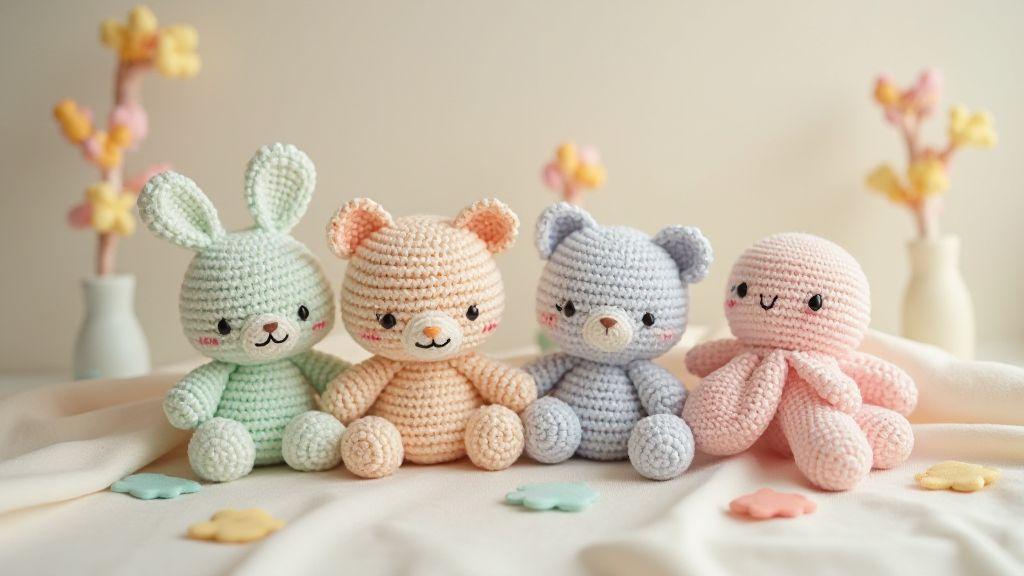
Pastel color schemes for your amigurumi
Pastels turn amigurumi into soft, friendly companions. Light tones let stitches shine without shouting. They suit babies, pets, and everyday decor, building harmony by placing colors comfortably next to each other. Pastels are forgiving, hiding minor tension issues and inviting gentle shading and texture for a more lifelike feel.
Lighting matters: pastels read differently in daylight versus indoor lamps. Test color squares under your typical lighting to avoid surprises. A pastel palette should feel like a friendly invitation to cuddle, not a loud shout.
Why soft pastels
Soft pastels create a welcoming vibe that blends with many fabrics and surroundings, staying timeless and versatile. They’re easy to pair, with one dominant color and lighter accents to keep the face readable and the overall piece cohesive. Pastels also allow tiny custom tweaks (like a scarf or bow) without clashing with the main color.
Pastels give room to grow: you can add subtle shading and highlights as you gain confidence, while keeping the look polished and friendly.
Easy pastel color palettes you can copy
Building a pastel palette start with a main color and two or three soft accents. Examples:
- Blush pink mint green cream
- Lilac pale yellow soft gray
- Powder blue soft coral ivory
Neutrals help the main pastels pop. A touch of white or light gray anchors the look. Start with a cream or warm gray base and add three soft accents. Test swatches to ensure harmony.
Pick a dominant and a pastel accent
Choose one dominant color for the majority of the piece and one pastel accent to highlight features—eyes, cheeks, a bow, or a scarf. The accent should be smaller and lighter than the main color to keep focal points popping. If the piece looks flat, add a sharp eye detail or darker line for life without breaking the pastel harmony.
Use complementary colors for your amigurumi toys
Opposites on the color wheel create instant energy. For example, peach body with bold teal eye detail or coral hat with forest-green scarf. Keep the main color calm and the accent bold to preserve readability. Test palettes side by side under good light before stitching. A bright accent can define a face or paws without stealing the design.
How opposite colors add lively contrast
Opposites make features crisper and guide the eye. Let one color be the star and the other the enhancer. Avoid too many opposites to keep the design clean and readable.
How you balance contrast with neutrals
Neutrals act as a calm stage for vibrant accents. Use creams, grays, or soft browns to anchor the piece and give eyes space to shine. Test placement with a mock-up to ensure nothing competes too loudly.
Anchor your palette with soft pastels and neutrals
Soft pastels plus neutrals create a grounded, cohesive look. The pastels provide sweetness while neutrals hold the energy, making brighter colors pop without shouting. A base of cream or warm gray with three soft pastels keeps your pieces polished and wearable.
Why your neutrals calm bright hues
Neutral bases reduce visual noise, letting bright accents shine. They also add flexibility for changing looks later and help create a cohesive gallery of amigurumi.
How you choose a neutral base color
Neutrals should be warm, approachable, and easy to pair. Start with creams or warm grays; adjust with a touch of yellow for warmth or taupe for softness. Test swatches on your chosen yarn to ensure the neutral stays true through handling.
Mint and pink color combos for your amigurumi
Mint and pink marry softness with warmth for a friendly, approachable vibe. Use mint as the body or main accent and let pink highlight cheeks, bows, or buttons. This combo reads fresh and gentle; if any contrast feels harsh, add more mint to soften the balance. For kawaii styling, place pink mainly on the face and accents, with mint along limbs and torso to keep the color story clear.
Experiment with shading by swapping lighter or deeper pinks. A pale pink blush with a mint body reads as soft; brighter pinks with mint accents feel more energetic. Choose a cotton blend for crisper color edges.
Why mint and pink suit kawaii style
Mint brings a soft, cool tone; pink adds warmth and innocence—perfect for kawaii. This pairing yields cuddly, approachable characters. You can keep it classic with pale tones or push to modern with brighter pinks and lighter mint. If you’re making a small bear or bunny, mint main with pink accents keeps the character soft and huggable.
Keep lines smooth and surfaces rounded. Hide color changes in seams or subtle stripes to maintain a clean color story. Always ask: does this feel cute and approachable? If yes, you’ve nailed the mint-and-pink balance.
How you adjust tones for sweet or modern looks
For a sweeter look, use lighter pinks and gentler mint on larger areas, with small pink cheeks and a mint nose. For a modern vibe, introduce brighter pink and crisper mint, using bold blocks on accessories or details. Outline features with a darker edge or add mint stripes to keep the look fresh while staying cute.
Try mint, blush, and cream together
Mint grounds blush and cream for a refined, soft look. Mint on the body, blush on cheeks or inner ears, and cream on tiny details like paws or a belly patch creates a brighter overall feel without losing warmth.
Bright playful color palettes for your amigurumi
Bright colors bring energy and whimsy. Build a palette with a dominant color for the main shape, plus two or three accents for eyes, mouth, or patterns. Layer color blocks so the character remains readable from a distance.
When you should pick bright colors
Bright colors suit characters with energy or mischief. Use bold pinks, blues, greens, or yellows for a playful vibe; pair contrasting brights for punchy accents. For photos or wearables, bright tones photograph well and pop against backgrounds.
How you avoid visual overwhelm
Limit to three main colors and one or two accents. A single dominant body color, a secondary feature color, and a high-contrast accent work best. If you add a third bright, keep it small and intentional. Balance by pairing a bright color with a neutral or softer shade.
Pair one bright with softer shades
Choose one bright star and surround it with softer colors to ground the design. For example, coral with soft creams or lemon with muted grays creates clear contrast without shouting.
The Best Color Combinations for Cute and Kawaii Amigurumi
When you want that irresistibly cute vibe, mix bright highlights with soft bases. Think sunny yellow with pale peach or vivid teal with creamy ivory. Keep the bright color as an accent, not the whole outfit, to maintain a friendly, approachable feel. Always test swatches on scrap yarn before finalizing the look.
Muted color palettes for your cute amigurumi
Muted tones soften edges and give your creations a cozy vibe. They let shapes and textures speak, making your plush feel warm and gallery-ready. Pair soft olive with peachy pink or dusty blue with ivory to tell a cohesive story. Use textures (matte vs. sheen) to add depth without breaking the soft mood.
Why muted tones give gentle charm
Muted tones create a quiet, approachable personality, letting expressions carry the emotion rather than loud color signaling. They support storytelling and photography, helping your amigurumi look deliberate and polished.
How you mute colors with grey or brown
Ground colors with grey or brown to soften brightness. Warm gray or taupe can soften blues and greens; brown acts as a natural anchor. Layer two muted shades for depth: apply one to main areas and the other to cheeks, paws, or accessories. Keep palettes consistent for a cohesive family of amigurumi.
Harmonious color blending for your kawaii toys
Colors blend best when close on the color wheel and similar in brightness. Layer transitions gently from light to dark, avoiding harsh edges. Test with a tiny swatch to ensure a soft, unified glow across the piece.
How you use analogous colors to blend
Analogous colors create smooth blends. Start with one base color, then add two adjacent shades. Layer light to dark, keeping layers thin and building slowly. If lines feel harsh, soften with a touch of the adjacent lighter shade. Stay within a close brightness range for seamless transitions.
How you shift value for smooth transitions
Shift value gradually: start with the lightest shade and move to darker tones to add depth without losing the soft, approachable look. Use small, directional strokes to avoid flat spots. Practice with quick value charts on scrap yarn to map how each shade behaves.
Kawaii crochet color pairing ideas for your projects
Soft pastels with bright accents create a gentle, cute vibe. Start with a pale main color and add contrast for eyes, cheeks, or accessories. If the main color is warm peach, pair with cool mint or lavender to keep balance. Test on a scrap to see what feels cohesive and what feels busy. The Best Color Combinations for Cute and Kawaii Amigurumi can guide your palette decisions as you grow.
Simple combos you can use as a starter
- Pink body with white accents for eyes and highlights (cream or baby blue as warm/cool twists)
- Mint green with peach accents for fresh, rosy-cheeked faces
- Lavender with soft yellow details for a gentle pop
Tools you can use to preview palettes
Color preview tools let you compare swatches side-by-side and adjust ratios. Digital palette tools help you test light and dark interactions and save favorite combinations for future designs.
Keep a swatch card for each design
Create a swatch card per project: main color, 1–2 accents, optional highlights, and mood notes. Label exact yarn names or codes. Swatch cards map what worked and guide future palettes, helping you build a cohesive collection.
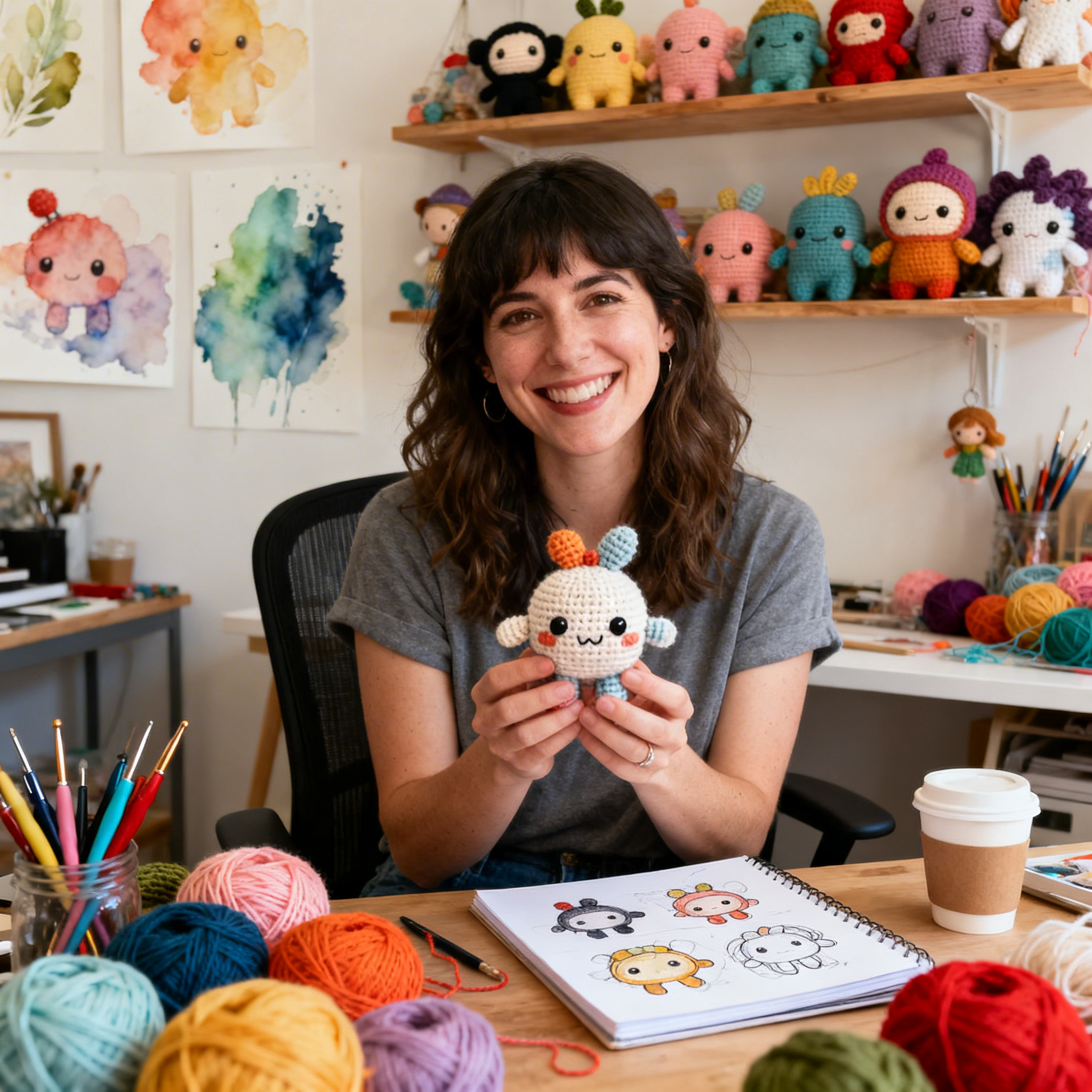
Clara Fern — Crochet Artist & Amigurumi Designer
Clara Fern is a crochet artist and amigurumi designer based in Austin, Texas. With 9 years of experience working with yarn and hook, she transformed a lifelong passion for handcraft into a creative mission: making amigurumi accessible, fun, and deeply rewarding for crafters of all levels.
Clara discovered amigurumi during a trip to Japan in 2017, where she fell in love with the art of bringing tiny characters to life through crochet. Back home in Texas, she spent years studying color theory, design principles, and advanced crochet techniques — developing her own signature style that blends kawaii aesthetics with original character design.
Through maclafersa.com, Clara shares everything she has learned — from choosing the right yarn and reading your first pattern, to designing fully original amigurumi characters from scratch. Her writing is known for being clear, detailed, and genuinely helpful, with no steps skipped and no secrets kept.
When she’s not crocheting, Clara enjoys watercolor painting, visiting local yarn shops, and drinking way too much coffee while sketching new character ideas.