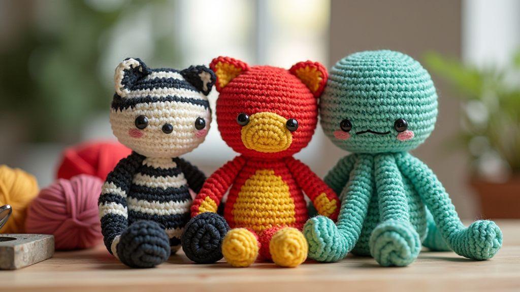
Choose contrast yarn choices for your amigurumi
Contrast makes your amigurumi pop. Use bold color pairs with clear separation to create crisp edges and recognizable shapes, readable from across the room. Test swatches in natural light to ensure strong differences—black with white, or bright red against teal work well. Remember: strong contrast helps your figure read with personality and presence.
Choose yarns that stay true to their color when crocheted. Some yarns blur in the finished piece even if they look distinct in daylight. Aim for clean differences and test swatches side by side. When you find a reliable contrast, your edges will stay crisp and your shapes confident.
For a bold, graphic feel, favor high-saturation yarns with steady opacity. Texture also matters: pairing a smooth yarn with a fuzzy one creates visible separation that helps the eyes read the form quickly. Your goal is a piece that communicates your design at a glance.
Pick yarn weight and fiber for clear contrast
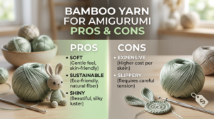
Weight and fiber influence contrast as much as color. Heavier weights with solid color read more clearly than lacy options. For bold edges and defined color blocks, try worsted or aran weight in solid or semi-solid colors. Smooth fibers like cotton and acrylic typically give cleaner color blocks with less sheen, keeping contrast sharp. Test blends, too, since some can add shine or texture that blurs intensity.
If you’re curious, crochet two swatches in the same color family but different fibers (e.g., cotton vs. acrylic) to see how value and gloss affect readability. This helps you choose the best combo for your project.
Compare contrast yarn choices for amigurumi
When comparing yarn choices, evaluate color readability, stitch crispness, behavior during shaping, and long-term wear. A strong contrast pair should hold its edge through increases, decreases, and playtime. If a color pills or feathers, its silhouette loses sharpness and harms the design.
For quick recognition, classic high-contrast duos like black and white, navy and coral, or white with a bold primary color work well for display or gifts. You can keep high contrast for character work by using mid-tone secondaries for facial features and accents. Note which pairs stay sharp and which blur at seams, and record them for future projects.
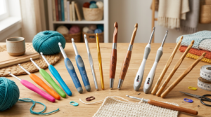
Make small swatches to test pairs
Crochet tiny swatches in two chosen colors side by side. A 10-stitch block per color lets you judge contrast in different lights. Look for crisp edges and clean separation; if colors blur when squinted, swap one color or fiber. Keep swatches handy while working the amigurumi to gauge feel, shape, and how seams affect color blocks.
Learn crochet amigurumi color theory
Color theory can elevate your amigurumi from cute to captivating. Treat color as personality: a sunny dress, a deep hat, or a soft face. Choose colors with purpose to ensure your final piece reads as intentional and balanced, with warmth, depth, and mood in every stitch.
Your choices should support form and expression. Softer tones and gentle contrasts create a friendly look, while brighter hues and stronger accents yield bold, playful characters. Keep a color notebook with brand, shade names, and reasons for choices to replicate or adjust designs later.
Use complementary and analogous color rules
Opposite colors on the color wheel provide strong, dynamic contrast for features like eyes or mouths. For a gentler look, use colors next to each other on the wheel. Start with one base color and add one or two accents that sit opposite or nearby to keep projects interesting and balanced.
Don’t overcomplicate it. Test one or two swatches first, and you’ll save time and yarn by avoiding clashes on the final piece.
Check value and saturation for strong contrast
Value (light vs. dark) and saturation (pure vs. muted) drive readability. Place intended colors side by side in a mock-up and ensure features read from a distance. Darken or lighten as needed, and adjust saturation for energy or calm. Keep a quick reference guide for value and saturation to speed color decisions on future projects.
Use a simple color wheel to plan schemes
A basic color wheel helps you plan. Build complementary pairs, triads, or split-complements with two to four core colors plus neutrals. Early on, keep palettes small and balanced. As you gain experience, you’ll internalize which combos feel you and speed up design decisions.
Plan bold color combinations for your crochet toys
Color is the secret to making toys pop. Start with a bold main color and add one or two accents that stand out against it. Mix warm and cool tones for contrast, but avoid overwhelming the design. Test palettes on small scraps before committing to the full piece to ensure a cohesive, bold look.
Accessibility matters: high-contrast pairings aid visibility, especially for photography and display. Ensure major features like eyes and mouth read clearly by placing light color against dark for key details.
Try color blocking amigurumi designs
Color blocking maps large color fields to major body parts—head, torso, ears, limbs—for a modern, graphic feel. Begin with two or three dominant blocks and add small accents to guide the eye. Crisp color blocks give a confident silhouette and make planning and sewing easier across projects.
Balance bright and neutral shades for focus
Bright shades draw attention, while neutrals give space to breathe. Use a standout color for a focal feature and neutrals for larger areas to guide the viewer’s eye. Mix textures—smooth neutrals with a brighter, shinier hue—to keep the design readable from a distance and up close.
Sketch color blocks before you crochet
Sketch simple color blocks to lock in a plan. Map each body part to a color, noting where blocks sit. A quick drawing or grid acts as a reference, saving time and reducing color mismatches during assembly.
Add contrast edging and detailing to define shapes
Outline key shapes with two contrasting colors to keep the silhouette readable. Use bold edging around ears, noses, and limbs, and crochet with even tension to prevent puckering. Edging creates a visual hierarchy, drawing attention to the most important features first.
Use contrast edging and detailing amigurumi
Color matters: outline with a bright color against a dark body (or vice versa) to ensure the edge reads clearly. Keep inner facial features in the same color family to maintain cohesion. Deliberate detailing—tiny stitches at joints, or a few well-placed lines—suggests movement without clutter.
Practice with small samples to discover what reads best in real life and reuse successful edging styles across projects.
Add embroidered highlights for eye-catching amigurumi color schemes
Embroidered highlights on cheeks, the nose, or whiskers add dimension. Use a slightly shiny thread for a subtle glow, keeping stitches short and controlled. Limit to one or two highlights per piece to avoid overwhelming the design. Test on scraps first to ensure the highlights read well in photos and in person.
Finish seams with a contrasting slip stitch
Conceal seams with a contrasting slip stitch to create a deliberate line rather than a weak edge. Align pieces carefully and maintain even tension. Mark starts and ends of seams to stay organized and achieve a polished finish.
Layer texture and contrast in your amigurumi
Layer texture and contrast by planning where highlights and shadows will live. Alternate smooth stitches with small texture tricks (bobble rows, a lacy panel) to add depth while keeping the color scheme cohesive. If a region feels too uniform, insert a tiny texture or color pop to guide the eye.
Mix stitch textures to add visual depth
Combine stitches to add depth without changing color. A simple single crochet with a subtle half-double or small cluster creates tactile contrast that reads well at a distance. Place texture changes near facial features to keep expressions legible.
Use fuzzy or shiny yarns for selective highlights
A touch of fuzz can imply fur or fluff, while a touch of shine works for accessories. Use sparingly to avoid overpowering the base color. A few well-placed accents create a focal point with dimensionality.
Compare textures on the same color for impact
Texture changes on the same color keep the look cohesive while adding depth. A smooth body with a textured feature (like the cheeks) guides the eye and enhances readability.
How to Create High-Contrast Amigurumi for Visual Impact
This is where you consolidate what you’ve learned for maximum impact. Pair dark and light shades in small, deliberate areas to direct attention to features you want highlighted. Keep transitions clean so contrast reads clearly in photos. A couple of high-contrast zones are enough to create drama without overwhelming the piece.
For a practical approach to How to Create High-Contrast Amigurumi for Visual Impact, start with a bold main color and test a couple of accent blocks on swatches. This pre-check helps you maintain cohesion and confidence when you crochet the full piece.
Test high-contrast amigurumi patterns and display for impact
Test bold color combos with quick samples to see how they read in real life and in photos. Keep a running notebook of contrasts that photograph well and those that look softer up close. Rotate patterns to study how the eye travels across the piece, and gather feedback from others to refine your approach.
Document results with notes and photos. When you scale up, you’ll already have reliable recipes to reuse, ensuring your amigurumi reads loud and clear both in person and on camera.
Follow high-contrast amigurumi patterns when possible
Following proven patterns helps you learn balance and color placement quickly. Use patterns as a baseline, then push boundaries with confidence on future projects. Patterns are a solid footing for creative exploration.
Photograph and light your toys to boost visual impact crochet amigurumi
Natural light is your ally for color accuracy. Diffused indoor light reduces glare and preserves true color. Experiment with side and front lighting to reveal texture and color fidelity. A light box or reflector can help soften shadows and keep contrasts true in photos.
Choose a background that makes colors pop
Backdrops should support, not steal focus. Neutral backgrounds let bold colors sing, while darker edges can frame bright blocks for dramatic contrast. Test a few options to find the setting that best showcases your amigurumi’s sharp edges and clean lines.
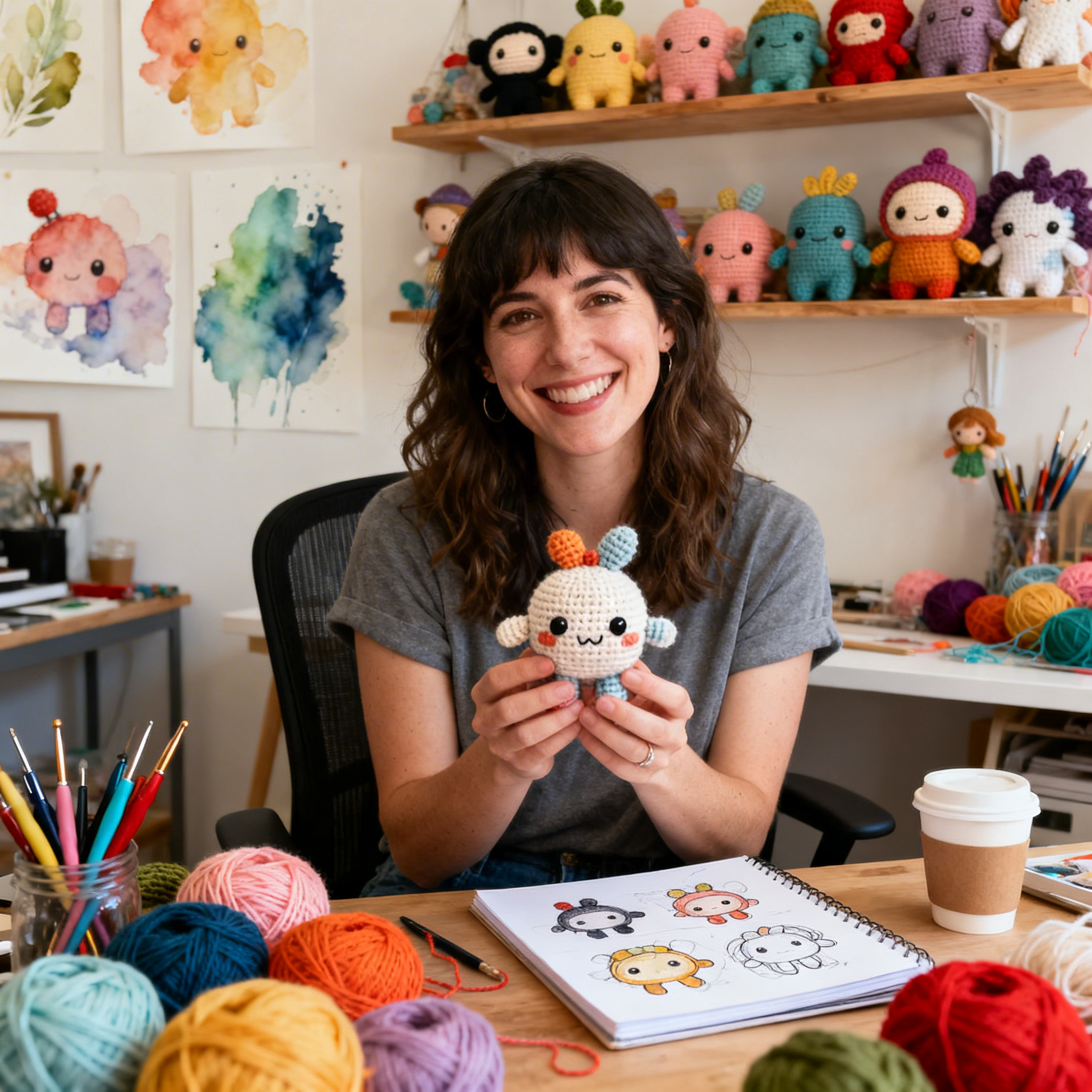
Clara Fern — Crochet Artist & Amigurumi Designer
Clara Fern is a crochet artist and amigurumi designer based in Austin, Texas. With 9 years of experience working with yarn and hook, she transformed a lifelong passion for handcraft into a creative mission: making amigurumi accessible, fun, and deeply rewarding for crafters of all levels.
Clara discovered amigurumi during a trip to Japan in 2017, where she fell in love with the art of bringing tiny characters to life through crochet. Back home in Texas, she spent years studying color theory, design principles, and advanced crochet techniques — developing her own signature style that blends kawaii aesthetics with original character design.
Through maclafersa.com, Clara shares everything she has learned — from choosing the right yarn and reading your first pattern, to designing fully original amigurumi characters from scratch. Her writing is known for being clear, detailed, and genuinely helpful, with no steps skipped and no secrets kept.
When she’s not crocheting, Clara enjoys watercolor painting, visiting local yarn shops, and drinking way too much coffee while sketching new character ideas.