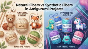
Pick the best yarn for amigurumi skin
You want yarn that feels soft against the skin and stitches up cleanly so your amigurumi ends up smooth and cuddly. Acrylic blends are a solid starter choice because they’re affordable, easy to wash, and hold shape well. For a more natural feel, consider cotton blends or super-soft acrylic for a gentle touch. Some fibers pill less than others, which matters for long-lasting toys your fans will reach for again and again. If your piece will be washed often, acrylic’s durability shines through.
Color matters, too. For skin tones, you need a range that matches your character and blends with the rest of your palette. The Best Yarn Colors for Amigurumi Skin Tones and Characters is a guide you’ll hear a lot about—and for good reason: you’ll want options that read warm, cool, or neutral on a tight stitch. If a yarn is a touch thicker than expected, you can still get a neat finish by switching to a smaller hook. Test on a small scrap under natural light to compare it to your intended skin shade.
Your yarn should be easy to work with, not stubborn. If you’re new, start with a beginner-friendly yarn and check that the twist isn’t too tight—loose twists can unravel, while tight twists can pull stitches. Soft doesn’t have to mean fragile; you want durability that stays comfy to touch after play.
Why acrylic and cotton work well for you
Acrylic feels forgiving: affordable, colorful, and easy to clean. Use it for bright features or outfits because it resists staining and keeps a neat shape. For gifts, acrylic’s machine-washable nature is a plus. It also provides a consistent look across light, medium, and dark shades, helping your characters stay cohesive.
Cotton offers a different vibe: breathable and crisp, so stitches sit neatly and seams stay flat. It adds a natural feel for sunlit or rustic characters. Cotton blends balance comfort with durability, so softness and strength come together. You’ll notice cotton often comes in earthier tones that complement richer palettes.
Mix fibers to get the best of both worlds. A common trick is a cotton blend for main skin areas and acrylic for accents or tiny details. It’s like layering: you get the tactile feel you want without sacrificing ease of use. When sewing features, choose a yarn that’s easy to match so eyes don’t notice mismatched textures. The right combo makes your character look intentional, not stitched together.
Choose the right weight for your project
Weight affects both feel and speed. For most skin tones, a light to medium weight (DK or worsted) gives a smooth surface without crowding stitches. You’ll get clean, neat rounds that look professional, even if you’re a beginner. If you want a softer, cuddlier feel, a lighter weight helps, but consider the scale you’re aiming for.
Also consider hook size. A too-big hook with thin yarn can look loose; a too-small hook with thick yarn can look dense. Match your hook to the yarn label to keep stitches uniform. If you want tight, defined features, a slightly heavier yarn can provide more control over shaping. Beginners often start with DK weight to see progress without fighting the yarn.
Plan ahead: decide early if you’ll need extra stuffing or more detailed facial features. Heavier yarns require more structure, while lighter weights give delicate, airy looks. Your choice will influence how you shape ears, noses, and lips, so pick a weight that suits both the skin shade and the character’s personality.
Check yarn weight and gauge
Gauge tells you how big your finished amigurumi will be with a given hook and yarn. Always check weight and gauge swatches before starting a big project. A mismatched gauge can make eyes and accessories sit off. Do a quick swatch in your current stitch pattern to stay on track.
Compare your swatch to the pattern’s gauge and adjust your hook if needed. If your swatch is looser than the pattern, you’ll likely need a smaller hook; if tighter, go up a size. Keeping gauge consistent helps skin tones align with the rest of the design, so colors sit where you expect and shading reads properly. When mixing yarns for skin and features, gauge tells you how well they play together.
Mix yarn for realistic skin tones
You can achieve natural-looking skin tones by mixing colors. Start with a base shade that matches your character’s lightest skin, then add tiny amounts of warmer or cooler tones to create depth. The goal is to mimic how real skin shifts with light and shadow, not rely on a single flat color.
Think in small steps. Pick a base color, then test additions like peach, tan, or light brown. Blends shift as you pull strands together, helping you achieve a soft, believable look. Use a small tray to lay out the colors you’re considering, keeping your workstation organized and decisions quick during a project.
Once you nail a mix, you’ll see it translate across different parts of the piece. The same blend can work for cheeks, lips, and ears, so you don’t end up with mismatched tones at the finish line. Remember, the right mix isn’t a single shade; it evolves as your sculpture grows.
How mixing yarn for skin tones gives you control
Mixing gives you control over warmth, depth, and character. You’re the painter, choosing how much warmth shows in a smile or how cool the shadows look. A blend lets you recreate sunlit areas with lighter hints or deepen shadows with richer browns. This control helps you match real-life references or your imagination, making your amigurumi more expressive.
Start with tiny swatches to measure how colors behave when crocheted. If a blend reads too pink or too yellow, adjust before committing to a head or limb. This saves time and yarn and helps your final piece look cohesive. With practice, you’ll recognize which tones read as real skin and which you should avoid, building a personal color library you can pull from.
Use small swatches to test blends
Small swatches are your best friend for skin-tone accuracy. Crochet 2–3 tiny swatches from your base and accent colors, then make a simple circle or strip to compare. If texture or heft feels off, tweak the mix right away. This step prevents large re-dos later.
Testing on swatches saves time and yarn and helps you see how colors behave under different lights or tension. If a swatch looks muddy, swap a brighter hue or add a lighter shade. If it’s chalky, add warmth. Swatches map a color strategy you’ll reuse on future projects.
Test on a swatch
Crochet a small piece with your final blend to see how it behaves in real life. Look for even texture and smooth transitions between tones. If you see stripes or blotches, adjust the blend or tension to smooth it out. When you’re happy, apply the blend to larger areas. If not, revisit base color and accents until satisfied. A well-tested blend makes the amigurumi feel alive, not flat.
Match yarn to character ethnicity and age
Choose yarns that match the character’s ethnicity and age with respect. Test how a yarn reads on tight versus loose stitches, and test a small swatch first. You want a believable base color that isn’t cartoonish or uniform. Use slightly varied tones to suggest depth but keep the palette harmonious.
Plan for age in color choices: babies read as softer, lighter tones with gentle shading; elders may show warmth or cooler undertones. You don’t need many shades—just a few well-chosen ones that blend well. Layer light and mid tones to create gentle shading around cheeks and hands for a lifelike look. Preserve texture and consistency across parts if you switch brands; test for similar ply, weight, and fiber to avoid obvious seams.
Consider undertones when you choose colors
Undertones matter as much as the main shade. Warm undertones read sunny; cool undertones read calm or shadowed. Check several shades with different undertones and pick one base undertone with small tints for shading. Keep undertones consistent across head and hands to avoid a mismatched look. If the piece is in a dim room, undertones may shift cooler; in bright light, warmer notes may pop. Crochet a tiny face swatch in several undertones to see which feels right.
Adjust tone for babies, adults, and elders
- Babies: softer, lighter tones with minimal contrast for a cozy, approachable look. Avoid harsh lines near the nose or mouth.
- Adults: slightly more color variation, with subtle shadows at the jawline and under cheekbones for depth.
- Elders: gentle aging cues like a touch of gray or a cooler base with warm highlights on the cheeks to suggest life experience. The aim is respectful realism, not caricature.
Respectful color choices
Color choices should honor the character and real people. Use a restrained palette that blends skin tones naturally rather than bold, unrealistic hues. Thoughtful testing and a calm, respectful approach often yield the best results—the Best Yarn Colors for Amigurumi Skin Tones and Characters.
Keep notes on undertones used for each character to stay consistent. If unsure, choose colors closest to real skin tones and avoid neon or overly saturated hues for skin. Your work should communicate care and accuracy.
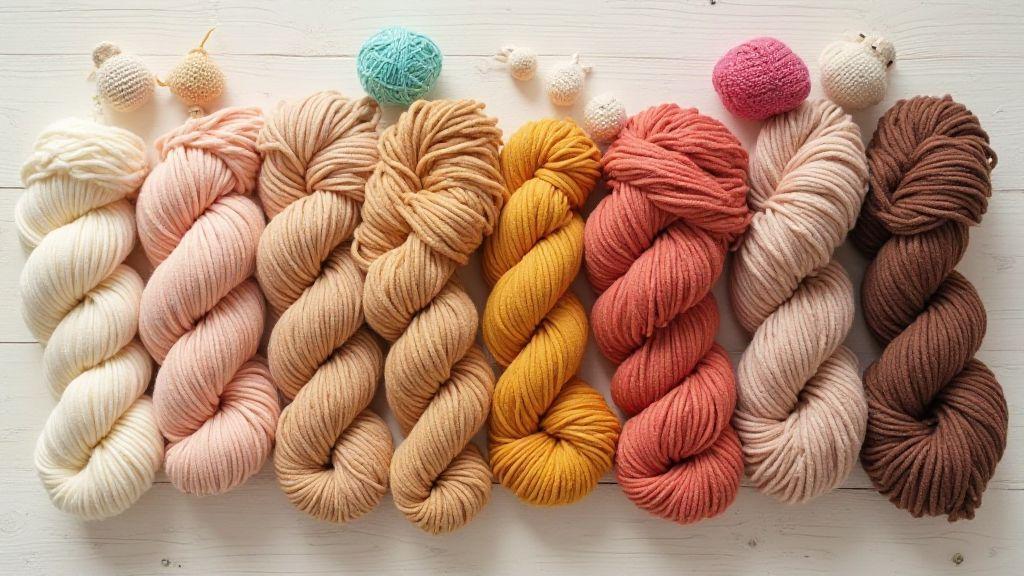
Build an amigurumi yarn color palette for diversity
Your amigurumi should celebrate every skin tone. Build three main groups: light, mid, and deep hues. For each group, choose two to three shades that work with your project’s clothing or features. Test each shade on a small swatch before committing. Label a dedicated set of swatches for quick access and plan color-block sets for base skin, blush plus highlights, and shadows. This keeps skin tones true to life while your character’s personality shines.
Include light, mid, and deep skin shades
Start with a light shade for highlights, a mid shade for the main color, and a deep shade for contour. Check under the eyes and along the jawline for natural contrast. Have at least two options per shade: base and warmer/cooler variants to match lighting. Test ahead to avoid abrupt transitions.
Keep your selection practical: ply smoothly, avoid twisting, and test finishes. Matte tones read more like skin in photos, while a touch of sheen can mimic light. Mapping shades to character design helps you switch between characters quickly.
If you’re crafting a diverse cast, ensure light tones cover very pale peach to cream undertones, mid tones cover a range from light browns to caramel, and deep tones span cocoa to espresso. Consistency pays off in expressive faces.
Use amigurumi skin tone yarn colors to plan sets
Plan color sets by age, ethnicity, and environment. For a sunny scene, lean toward warmer pinks and golden undertones; for winter, cooler undertones work well. Color-block palettes so you can mix and reuse across characters. Label sets for quick recall (e.g., Tier 1: warm caramel, Tier 2: neutral almond). A well-organized palette speeds up planning and keeps skin tones cohesive.
When brands or fabrics differ, swatch to reflect your usual materials. If you switch brands, keep a quick reference card with equivalent tones to maintain consistency.
Label and store swatches for repeat use so future projects stay efficient and color-consistent.
Label swatches for repeat use
Label each swatch with shade name and brand and note best use (shadow, base, highlight). Store swatches in a pouch or organizer for quick access. Clear labeling saves time and prevents color confusion on commissions or batch projects. A quick reference sheet above your space helps you stay mindful of color strategy.
Use neutral yarn shades for balanced designs
Neutral shades—beiges, taupes, creams, and light grays—create a calm canvas so eyes, hair, and clothes pop without clashing. Neutrals also hide minor texture differences when multiple fibers are used, helping stitches stay the star. Keep neutrals clean and evenly tensioned to maintain round shapes.
Undertones matter with neutrals too. Pair a soft beige with a lighter cream for subtle highlights or a warm taupe for recessed areas like elbows or cheeks. Neutrals train your eye to shape and stitch, letting your character’s personality emerge.
Be mindful of family similarity when switching neutrals to keep a cohesive finish. If you must swap mid-project, test a tiny swatch under the same light to ensure balance.
When to pick beige, tan, or greige for you
- Beige: warm, friendly base for soft shading.
- Tan: deeper with good depth for brows and shading without overpowering.
- Greige: modern base that sits between cool and warm notes.
Your choice guides the mood: beige for approachable characters, tan for shading depth, greige for contemporary vibes. For a cheerful character, beige with peachy cheeks works; for woodland themes, tan with mossy accents fits. Greige pairs nicely with icy blues and lavender highlights for cooler palettes.
Pair neutrals with brighter accent hues
Bright accents wake up a design. Start with a neutral base and add a pop of color for eyes, bows, or tiny accessories. Use one or two bright colors max to keep things readable. Try cool accents (mint, seafoam) and warm accents (peach, coral) and compare how they influence mood. Make eyes and buttons crisp with slightly brighter accents to draw attention.
A practical pairing: soft beige with a teal scarf or a coral cheek. Keep one focal color and a secondary shade to tie the piece together. Neutrals like beige or greige pair well with cool blues and greens; tan pairs nicely with warm pinks and oranges.
Add blush and shading with simple yarn techniques
Begin with a gentle blush on cheeks or ear tips using a lighter pink or peach. Dab color in small amounts to avoid overwhelm, then build shading with tiny stitches along the jawline or under brows. Keep tension even and transitions gradual for a warm, natural glow. Check from different distances; a soft glow reads as warmth up close and life from afar.
Blending blush with shading adds depth. Layer two or three soft tones in small areas, letting colors touch but not clash. Use light finger pressure or a damp cloth to blend edges if needed. Keep yarns smooth and kink-free for even blush application.
Practice to improve; compare progress photos over time. Maintain consistent texture by stitching in small, steady passes for a plush, lively face.
Blush and shading yarn techniques you can learn fast
Three quick methods:
- Dot method: tiny stitches of lighter color on cheeks, then blend outward.
- Soft blend: catch a little of each color in the same stitch and fade outward with lighter pressure.
- Whisper gradient: darker shade under the cheekbone, feather into skin color.
Keep stitches small and even. Use a fine hook and thin yarn for delicate blending. Test on swatches first and label color names to remember effective combinations.
Needle felting, embroidery, and layered stitches
Combine techniques for depth: needle felting for soft sculpted form, embroidery for fine color changes, and layered stitches for gradual transitions. Layer light color first, then mid-tone, then darkest shade in small amounts. Step back often to review balance. Bury ends to keep surfaces smooth and soft.
Choose pastel and vibrant yarns to set character mood
Pastels create gentle, approachable personalities; vibrant colors emphasize action and character. Start with soft pastels for skin tones or outfits, then add bright accents for eyes or accessories. Test color pairs before stitching to ensure balance. A pastel body with a bold hat or a soft face with bright cheeks can tell a story without a word.
Pastels read as soft and friendly; vibrant hues signal energy and personality. Balance by using one main color, a supporting secondary, and a single bright accent. Test mood in small samples to ensure harmony.
Pastel and vibrant yarns for amigurumi characters explained
Pastels provide warmth and approachability; highlights and blush stay gentle. Vibrants convey character and action; reserve for eyes, accessories, or details that should pop. Mixing both yields characters that feel real and expressive. Consider color mood as a tiny story: a pastel robe with a bold belt suggests quiet courage, while a rich teal with coral accents signals exploration.
Light pastel tones can act as highlights; deeper pastels add depth without overpowering. Use vibrant colors sparingly for emphasis to keep the color story cohesive.
Match color mood to personality you want to show
A mellow, gentle vibe favors soft pastels with matte finishes. A bold, confident character can carry vibrant colors with darker accents for balance. Choose a main color to set the mood, a secondary to support, and an accent for a spark. Test tiny swatches to confirm the mood before committing.
Balance color saturation
Saturation should be balanced: too much reads loud; too little fades away. Start with a saturated main color and desaturated versions for shading. Place bright colors in small areas (scarf edges, flowers, stripes) and use variations of the same hue to create depth. If the design becomes busy, reduce strongly saturated colors.
The goal is cohesion—colors should warm, bright, and deep in harmony so the piece feels inviting.
Manage dye lots and keep color consistency
Color consistency is essential. Label skeins and note dye lots to prevent shade shifts that show up on cheeks, paws, or ears. Lay out skeins for a section and compare in daylight; if there’s variance, blend or allocate areas to minimize visible changes. Pull from the same dye lot for adjoining areas; if you must mix lots, test first and blend or layer to smooth transitions. A simple system—label, compare, test, document—keeps your work professional.
Why you should buy one dye lot for a project
Using a single dye lot throughout a project ensures true color consistency, especially on faces and hands where small shifts are obvious. It saves time and reduces rework. If you must change lots, plan where the changes land and keep most of the work in one batch.
How to blend dye lots when needed
Blending dye lots helps when a perfect match isn’t available. Mix equal parts old and new dye lots, test on a scrap, and adjust. Apply the blend gradually where the lots meet, feathering the edge for natural transitions. On rounded surfaces, a gentle gradient works best. Keep notes of exact proportions for future rework. Layering a closer shade over the transition can smooth it further.
Adjust with small mixes
For tiny tweaks, use small mixes: 1–2 parts target color with a similar base. Test on a swatch until you find the right shade. Label and store these mixes with your dye materials to maintain color consistency across projects.
Test colorfastness and care for lasting results
Test colorfastness before washing the whole piece. If dye bleeds, choose a colorfast yarn or wash by hand with care. Note which skeins behave well for future projects. For colorfast yarns, eyes pop and stitches stay crisp after play.
Care for storage: keep amigurumi in a soft bag or breathable container away from heat and moisture. If a musty smell appears, air out in shade. Gentle handling preserves shape and color for lasting cuddles.
Wash tests to prevent bleeding on your amigurumi
Do a wash test on a hidden area with lukewarm water and mild detergent. If color transfers, avoid washing in water or choose colorfast yarns. If no bleed, hand wash gently and lay flat to dry. Darker colors may bleed slightly in the first wash; rinse thoroughly and dry flat. This prevents color transfer to clothes or skin.
Pick colorfast fibers for the best yarn for amigurumi skin
Colorfast fibers help keep skin tones true after washing or spills. Look for yarns labeled colorfast or tested for colorfastness. Cotton blends often hold color well and dry neatly. Run a quick colorfastness test on a small swatch if unsure. Colorfast fibers keep your skin tones warm and natural through many cuddles.
Store away from sunlight
Sunlight can fade colors. Store your amigurumi out of direct sun in a dry space. If a sunny room can’t be avoided, cover pieces with a breathable cloth to shield from UV rays while allowing airflow. This protects both colors and stitches.
The Best Yarn Colors for Amigurumi Skin Tones and Characters: Final note
The Best Yarn Colors for Amigurumi Skin Tones and Characters guide your palette decisions so your creations read warm, cool, or neutral on tight stitches. By planning with color palettes, swatches, and mindful undertones, you’ll craft skin tones that feel lifelike and respectful across diverse characters. Keep labeling, testing, and documenting to maintain consistency project after project.
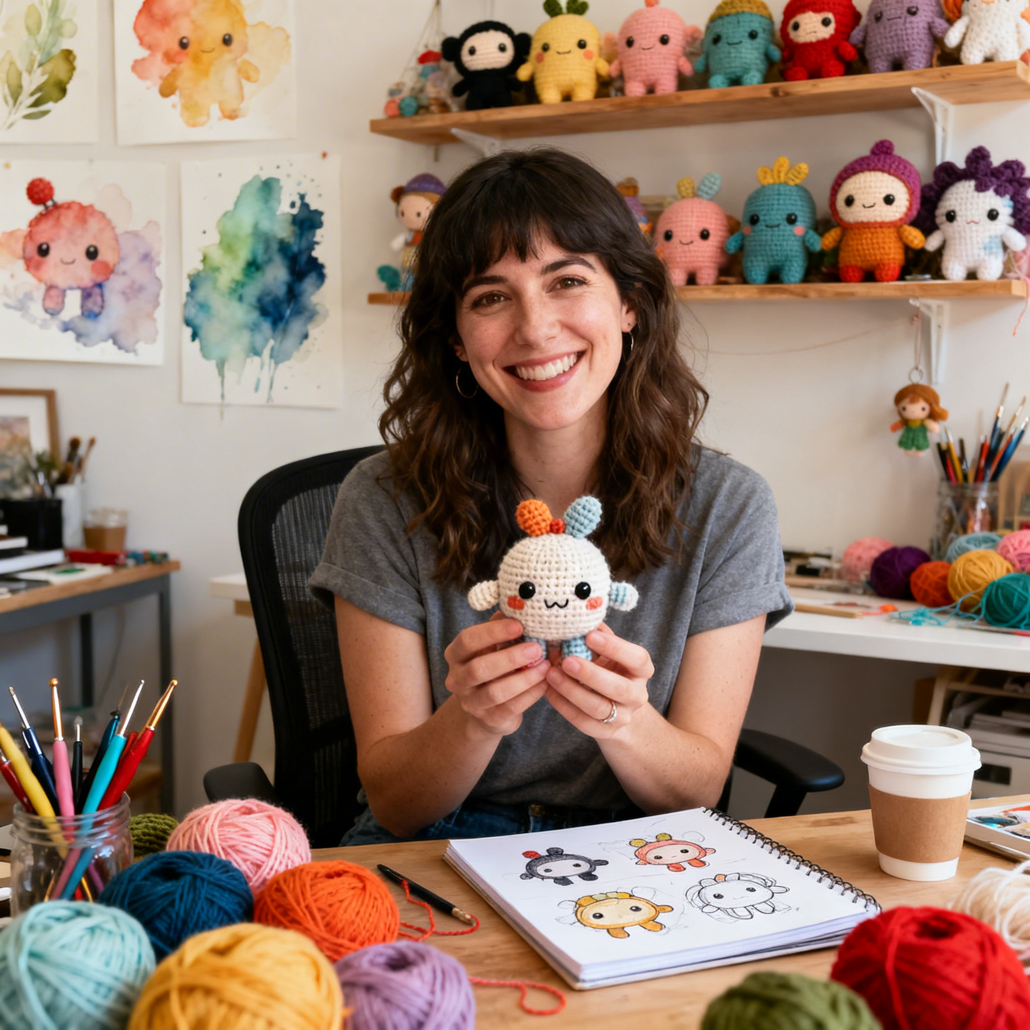
Clara Fern — Crochet Artist & Amigurumi Designer
Clara Fern is a crochet artist and amigurumi designer based in Austin, Texas. With 9 years of experience working with yarn and hook, she transformed a lifelong passion for handcraft into a creative mission: making amigurumi accessible, fun, and deeply rewarding for crafters of all levels.
Clara discovered amigurumi during a trip to Japan in 2017, where she fell in love with the art of bringing tiny characters to life through crochet. Back home in Texas, she spent years studying color theory, design principles, and advanced crochet techniques — developing her own signature style that blends kawaii aesthetics with original character design.
Through maclafersa.com, Clara shares everything she has learned — from choosing the right yarn and reading your first pattern, to designing fully original amigurumi characters from scratch. Her writing is known for being clear, detailed, and genuinely helpful, with no steps skipped and no secrets kept.
When she’s not crocheting, Clara enjoys watercolor painting, visiting local yarn shops, and drinking way too much coffee while sketching new character ideas.